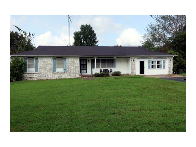
The house on trailridge road… the house that me, Brandon, and Brandon’s business partner, Clint, have been working on for SEVERAL months now is FINALLY FINISHED!!!!
Today, I’m taking you on the grand tour of all the before and afters… so grab your popcorn and a Dr. Pepper, because it’ll be a show!!
Real quick before we get into it… I did want to mention a few things that were the SAME around the house!
- ALL wall colors were painted with Sherwin Williams Repose Grey
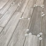
- We used the same laminate flooring throughout the house in the color “smoked hickory”. We bought it from a local home improvement store!
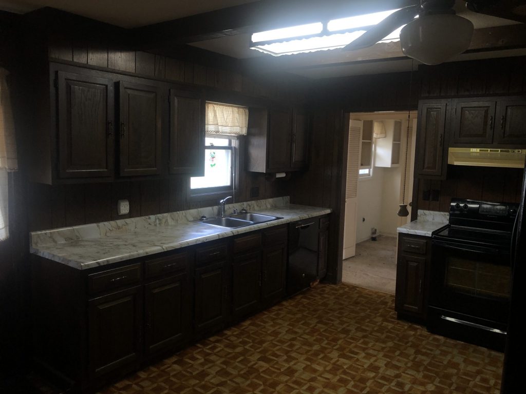
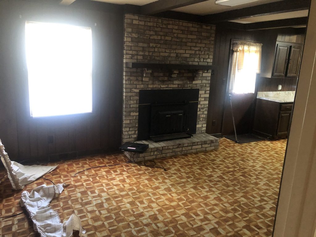
Kitchen Before
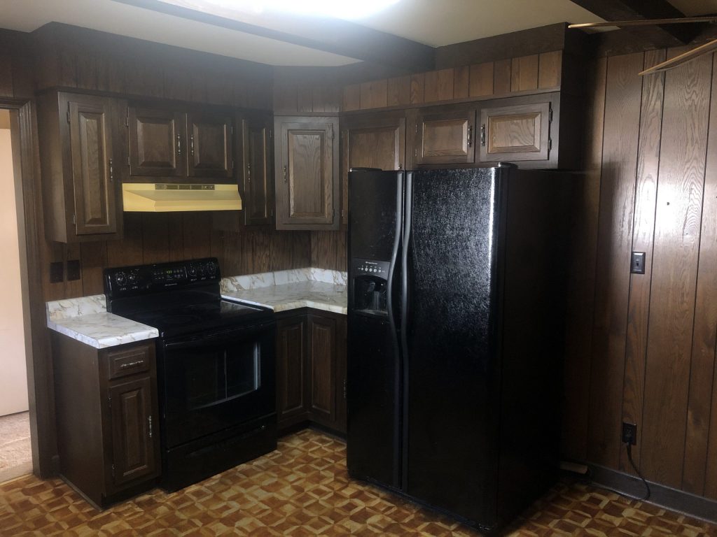
From the get-go, your eye IMMEDIATELY goes to the horrid flooring!!! We knew that had to go ASAP… along with the all the dark cabinets!
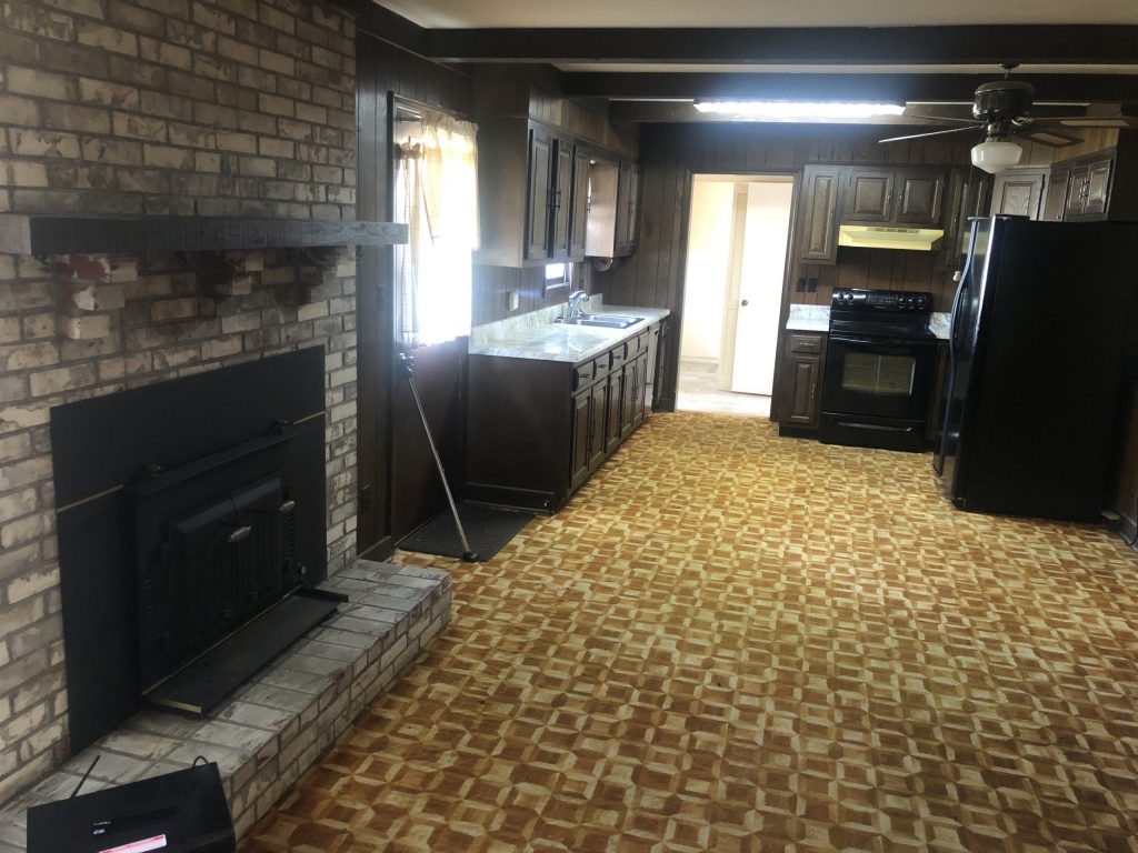
The main thing we LOVED about this kitchen was the fireplace. The color, the placement… EVERYTHING. We knew we wanted to keep this in it’s original state.
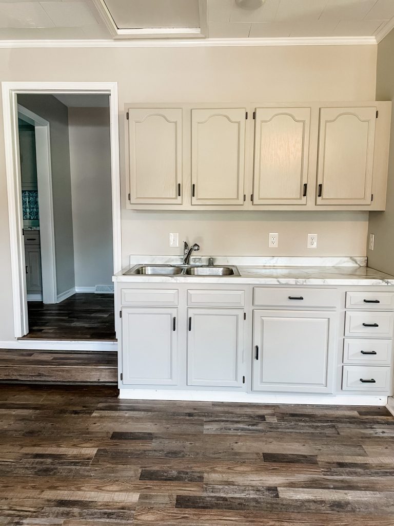
Kitchen After
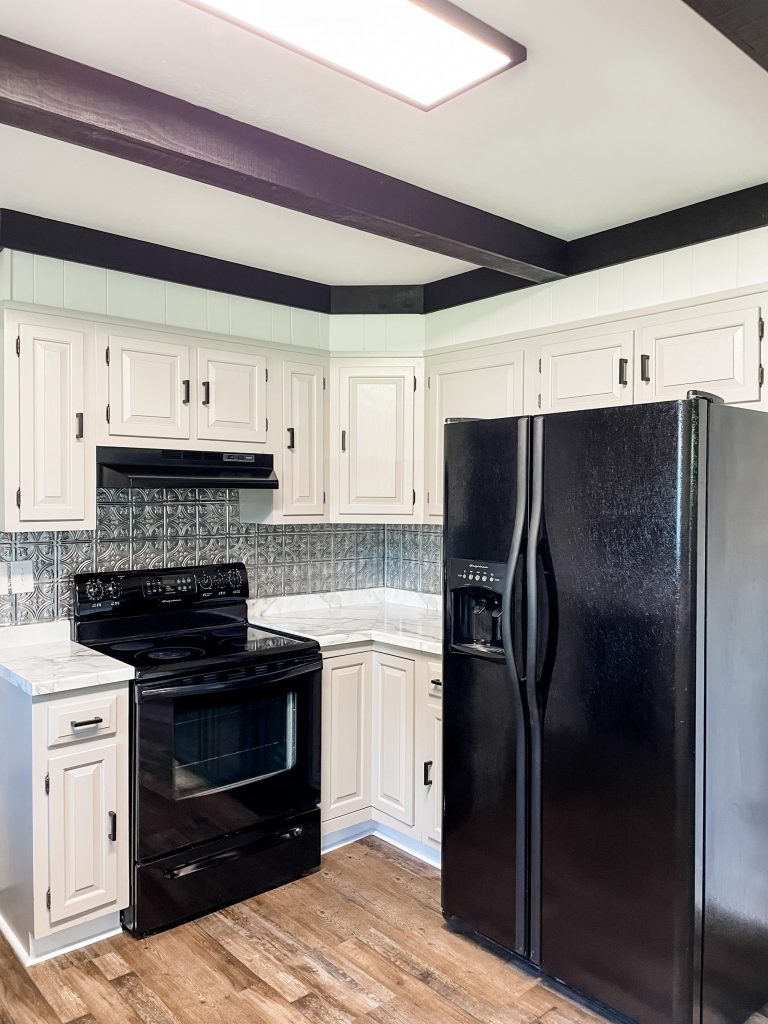
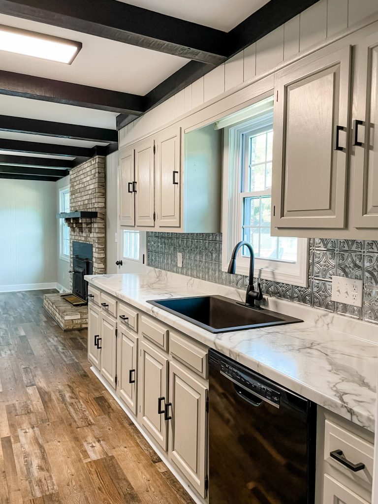
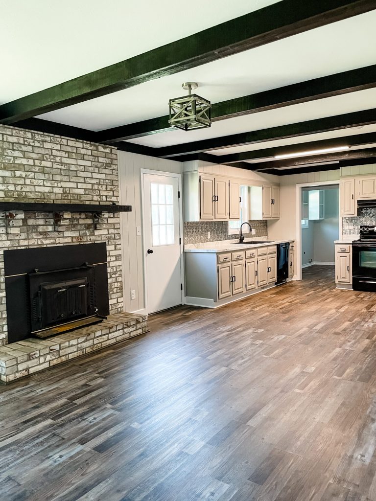
I mean…. can you say HOLY COW?!?!?! We left all the appliances the same (except for the oven hood) and kept the original cabinets.
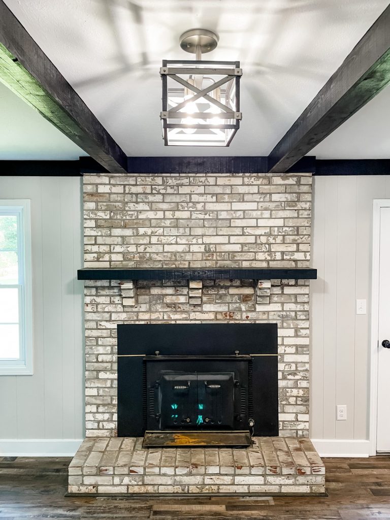
I truly cannot tell you how OBSESSED I am with this makeover!!!! Let me tell you ALLLLL the details:
- cabinet color: Mindful Grey by Sherwin Williams
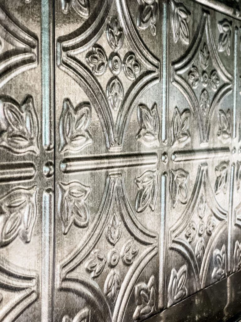
- backsplash: from Lowes, linked here
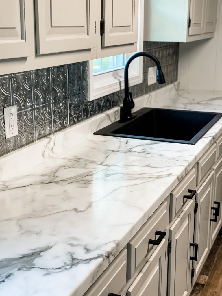
- sink: from Lowes
- countertop: Formica Calacatta Marble
- faucet: from Lowes
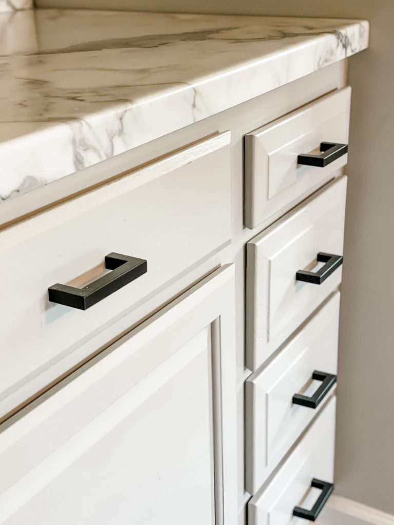
- pulls: from Amazon, linked here
- shiplap: Home Depot
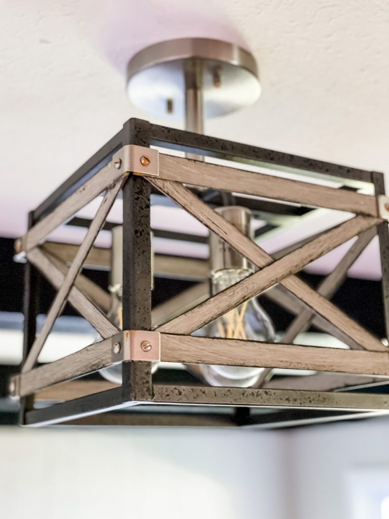
- light fixture: Menards
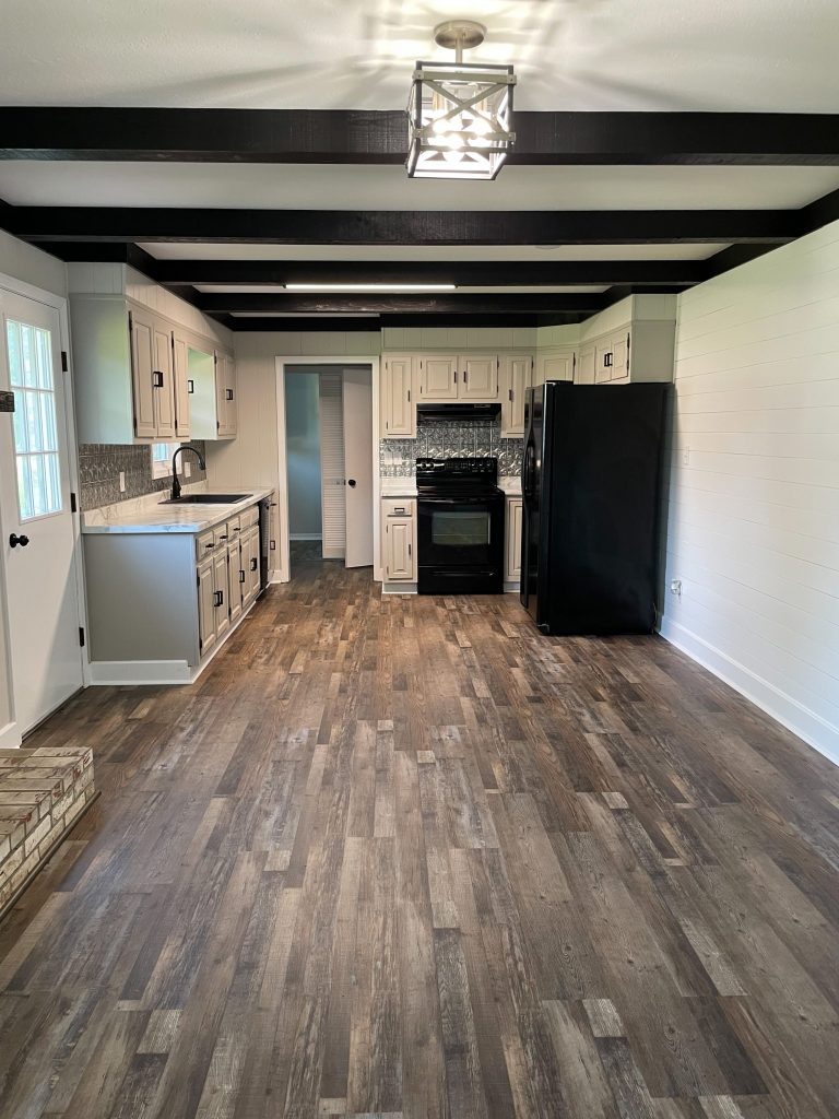
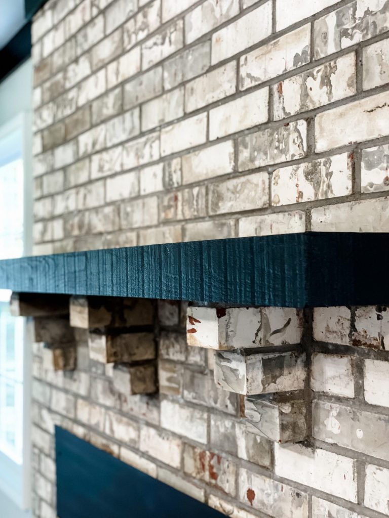
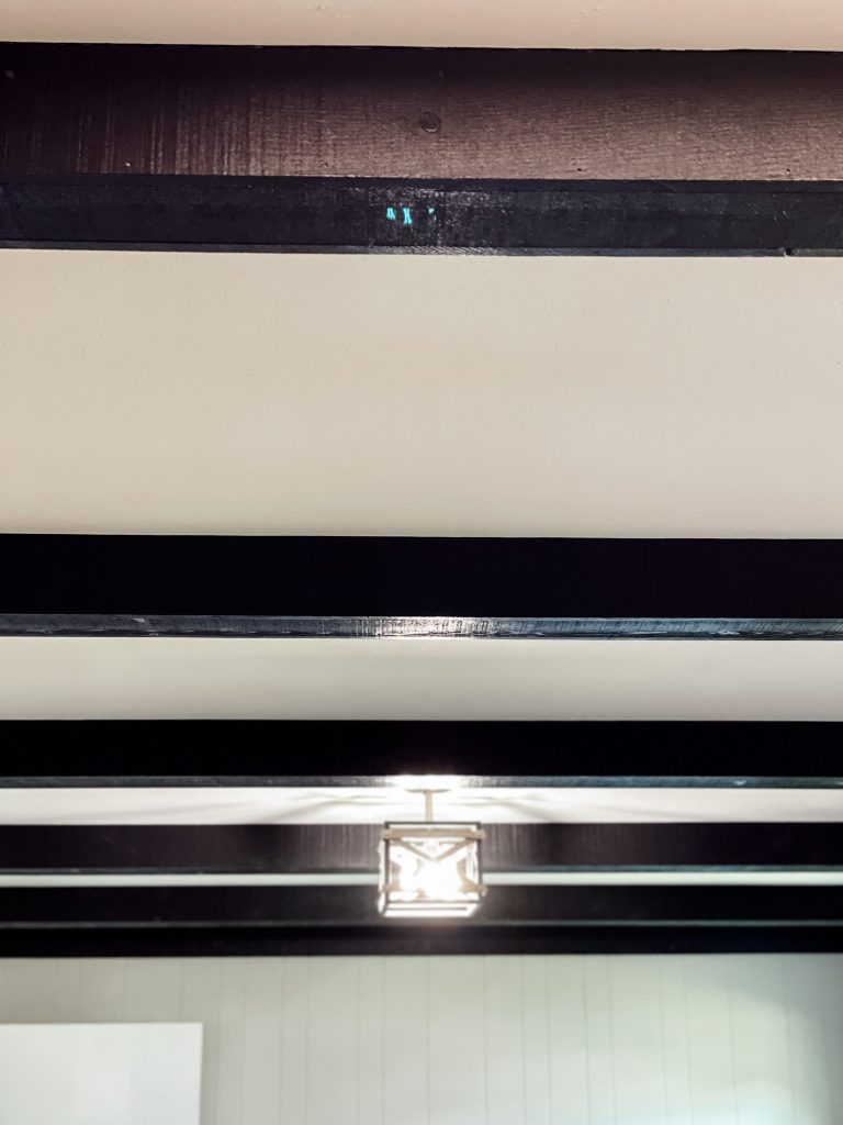
We left the fireplace completely untouched, and just painted the mantel with black paint. We used the same paint for the faux wooden beams on the ceiling!
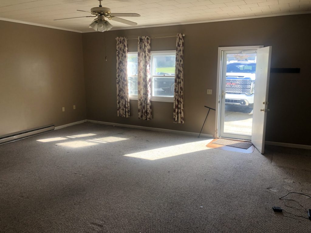
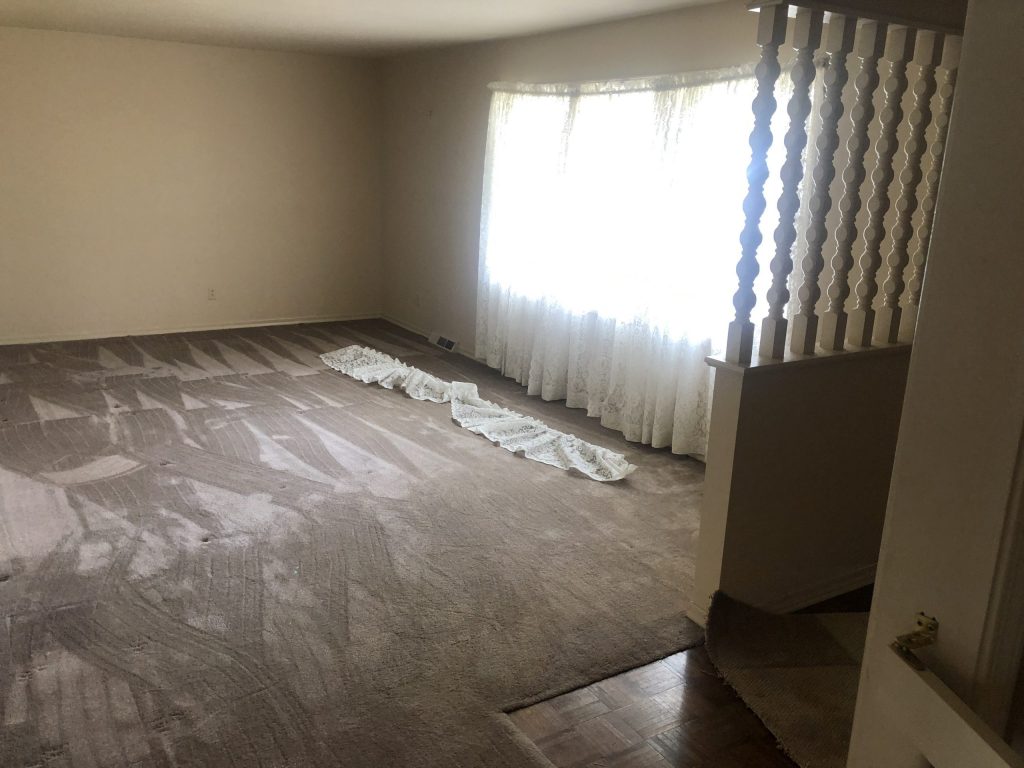
Living Room Before
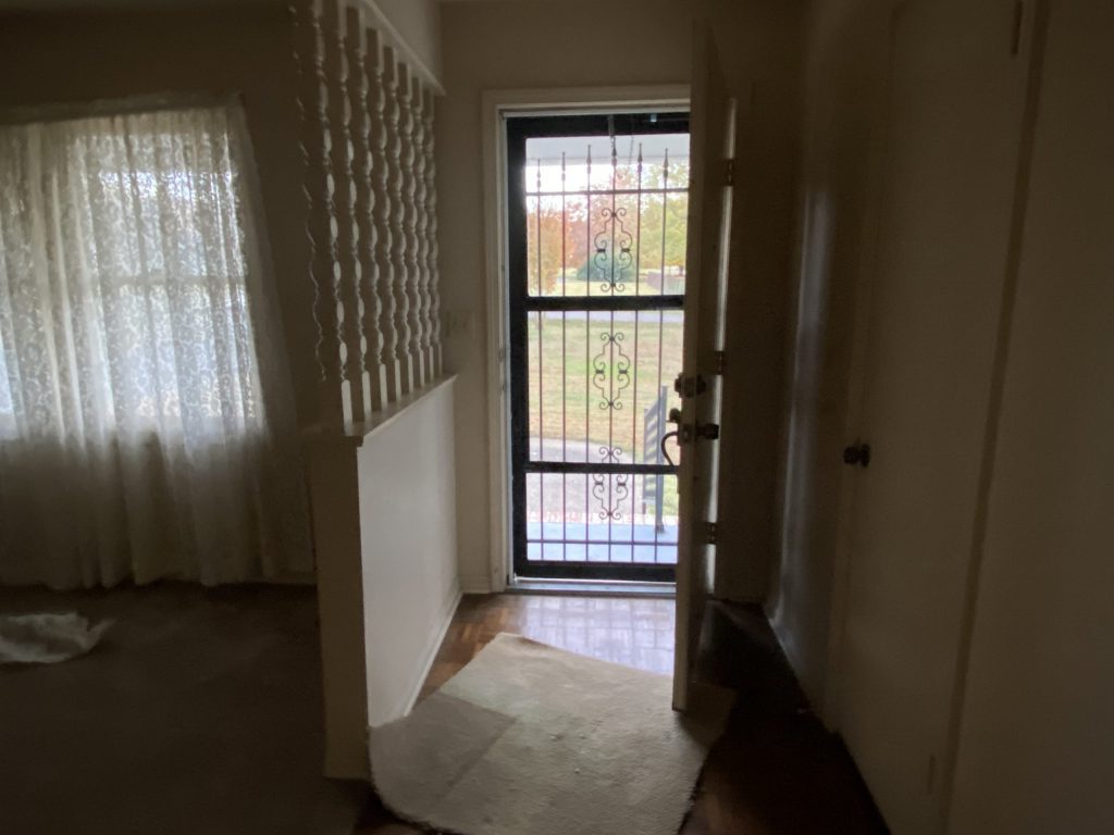
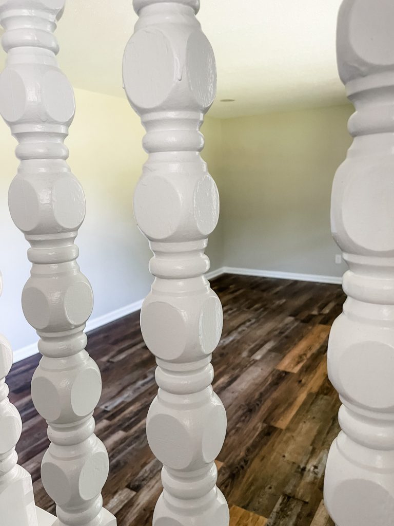
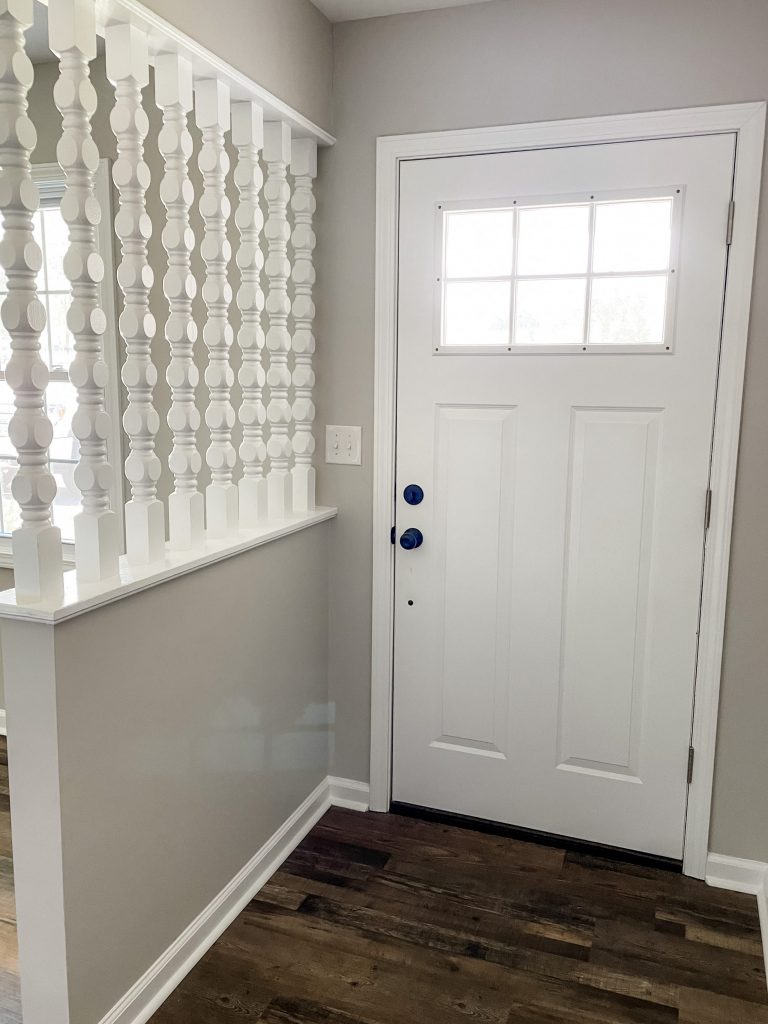
We love how quaint this living room was… and how it had the half wall with spindles! We decided to keep that part… but that was about it 😂
Living Room After
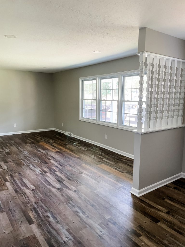
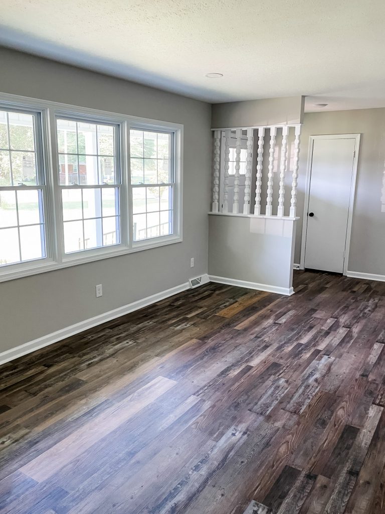
After new windows, a new front door, and of course fresh paint and new flooring… this living room is ready to be furnished!!!
We bought the front door from Home Depot, and painted all the baseboards/trim/spindles with white paint by Sherwin Williams.
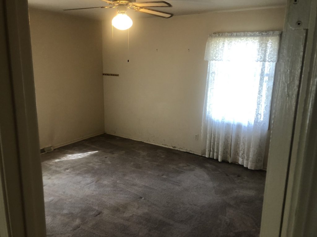
Bedrooms Before
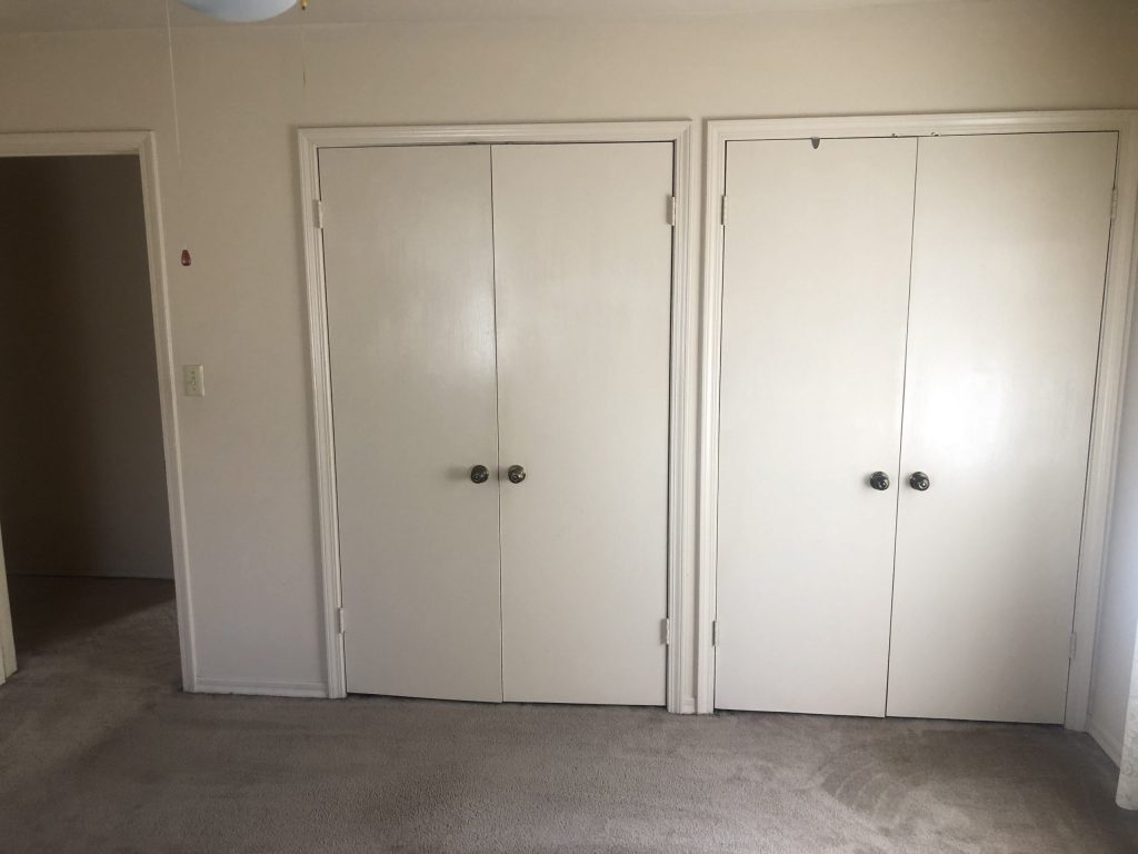
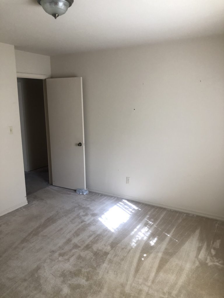
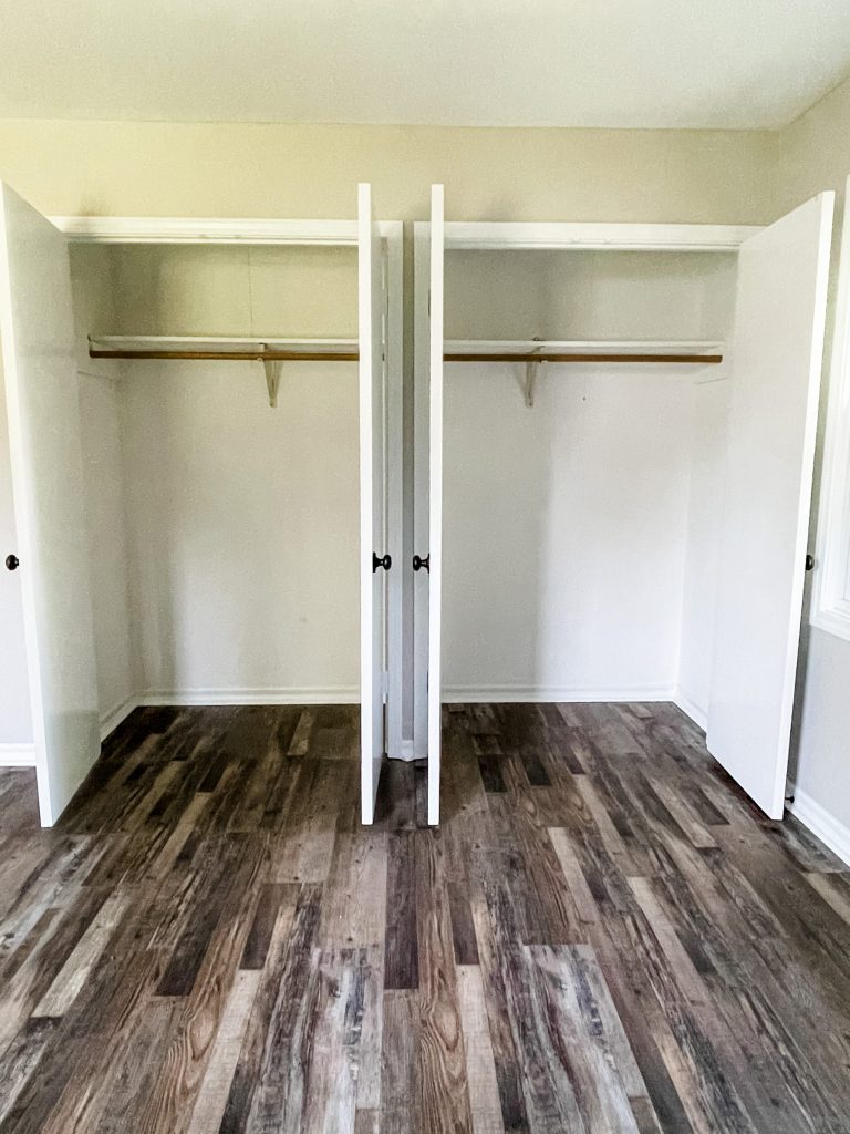
This home has three bedrooms, and they all basically looked the same. The only difference is the master bedroom had two closets instead of one, which you can see above!
They were pretty dingy, and the carpet was super outdated… the light fixtures needed to be replaced as well.
Bedrooms After
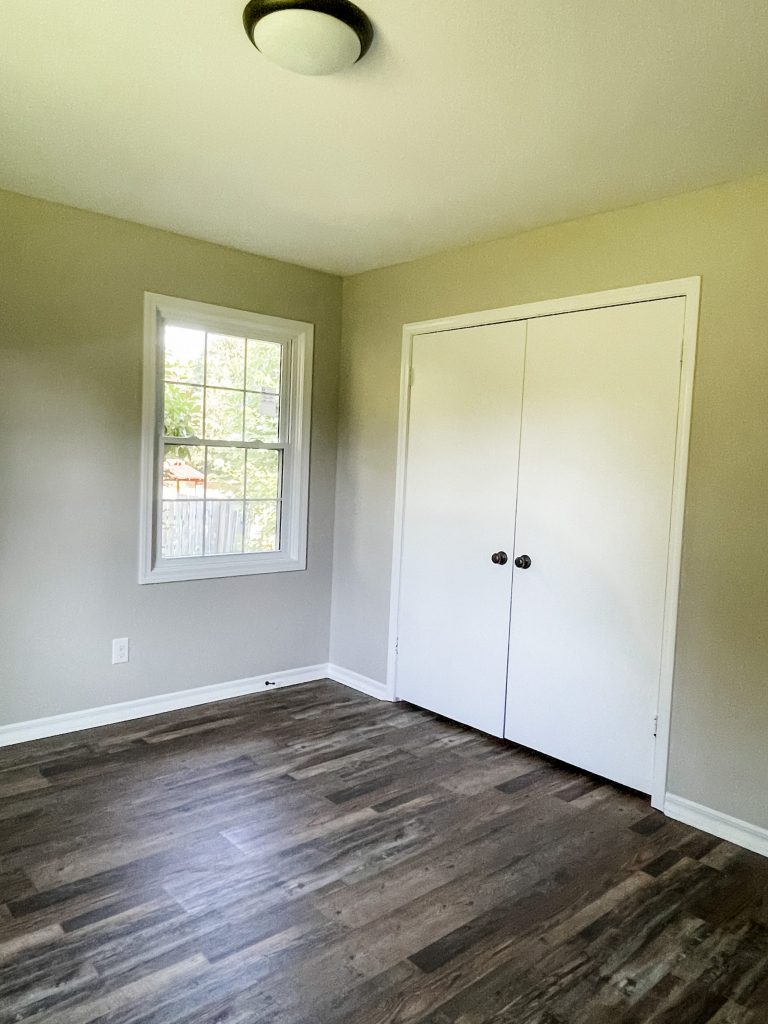
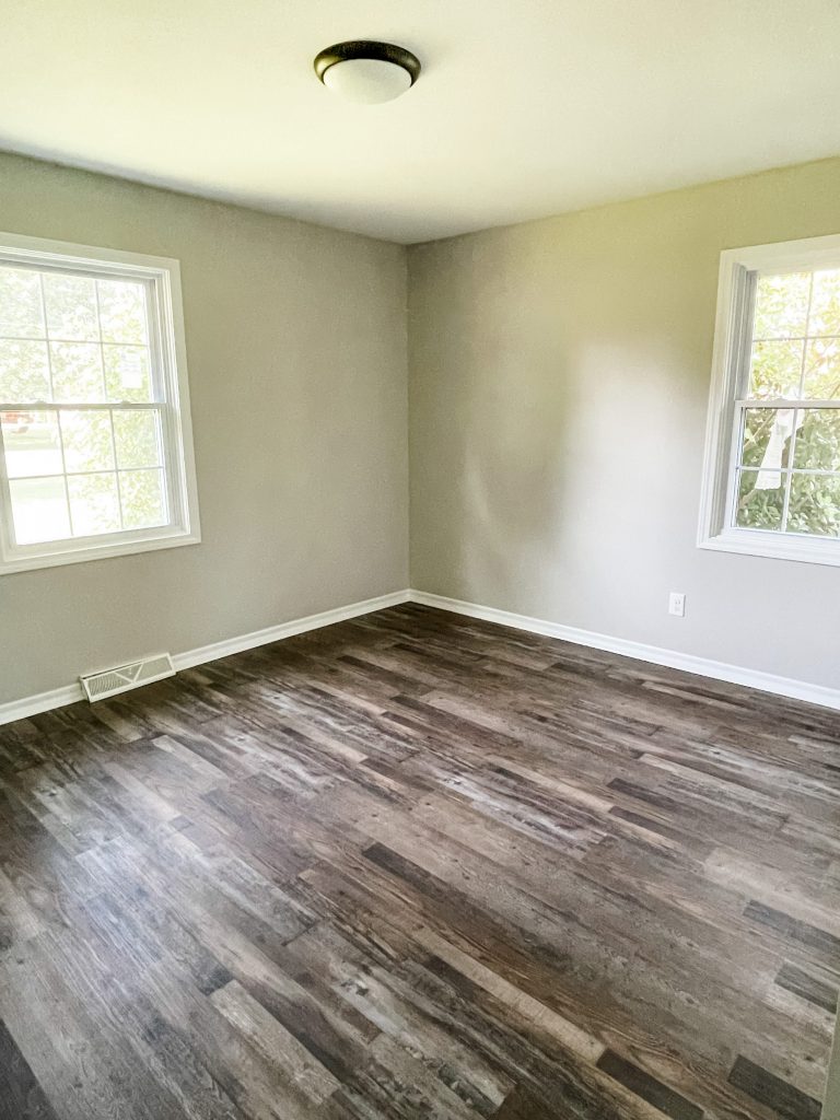
NOW, they are MUCHHH more in style, and just feel so much cleaner. Each bedroom got new paint, new flooring, and new light fixtures!
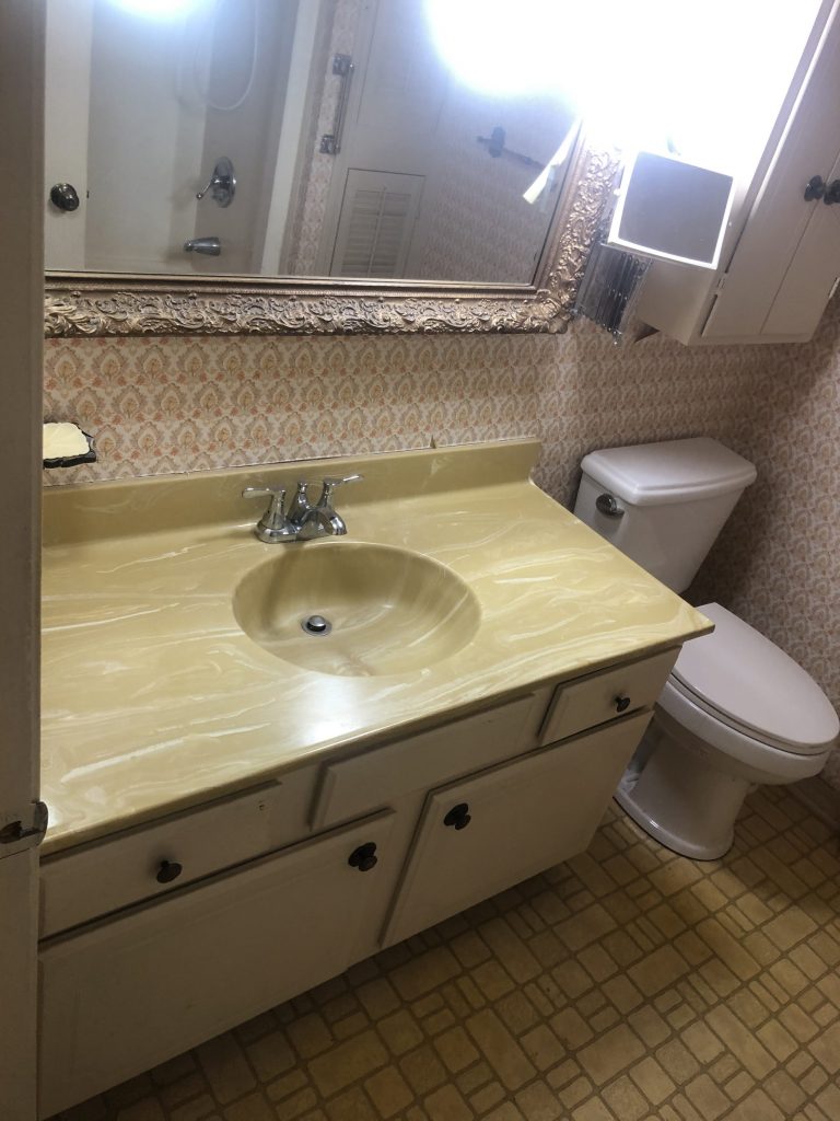
Guest Bathroom Before
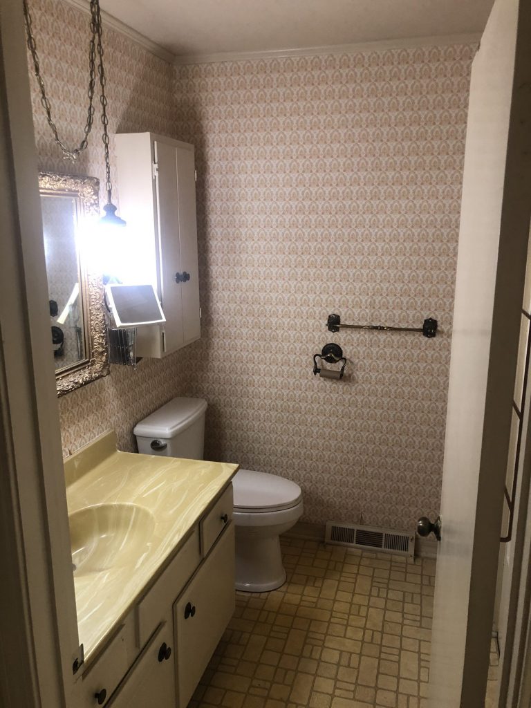
This bathroom looks like it came straight from the 70s… LOL. None of the colors went well together, and can you see that hanging light fixture?! Our work was cut out for us in this room!
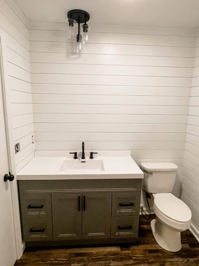
Guest Bathroom After
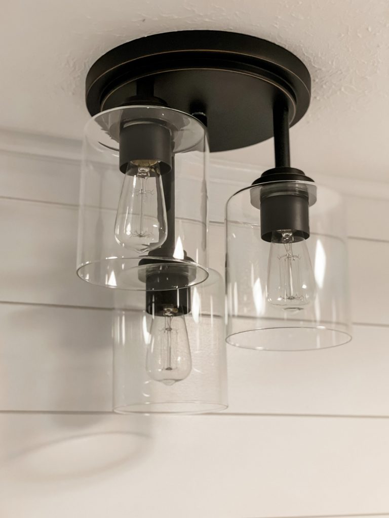
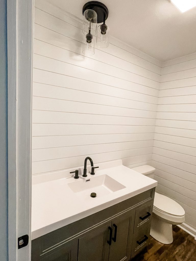
Ahhhh. Much better! Let’s break it down:
- vanity: from Menards (it was already painted this color)
- faucet: from Lowes
- pulls: amazon, linked here
- light fixture: Menards, linked here
- toilet: Lowes
- shiplap: Home Depot (painted white)
- kept the original shower
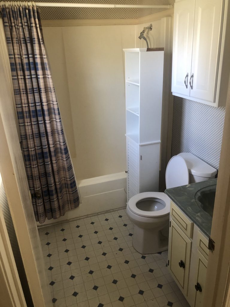
Master Bathroom Before
Do your eyes hurt from looking at all the different patterns and colors?!?! LOL!
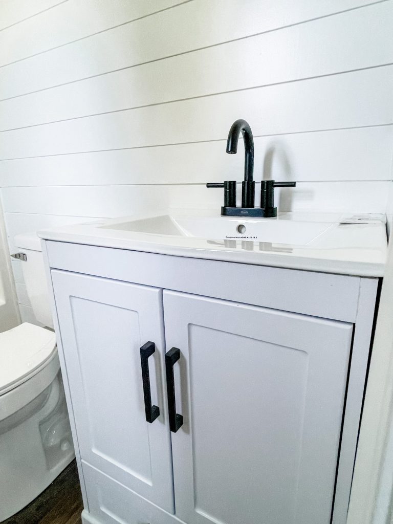
Master Bathroom After
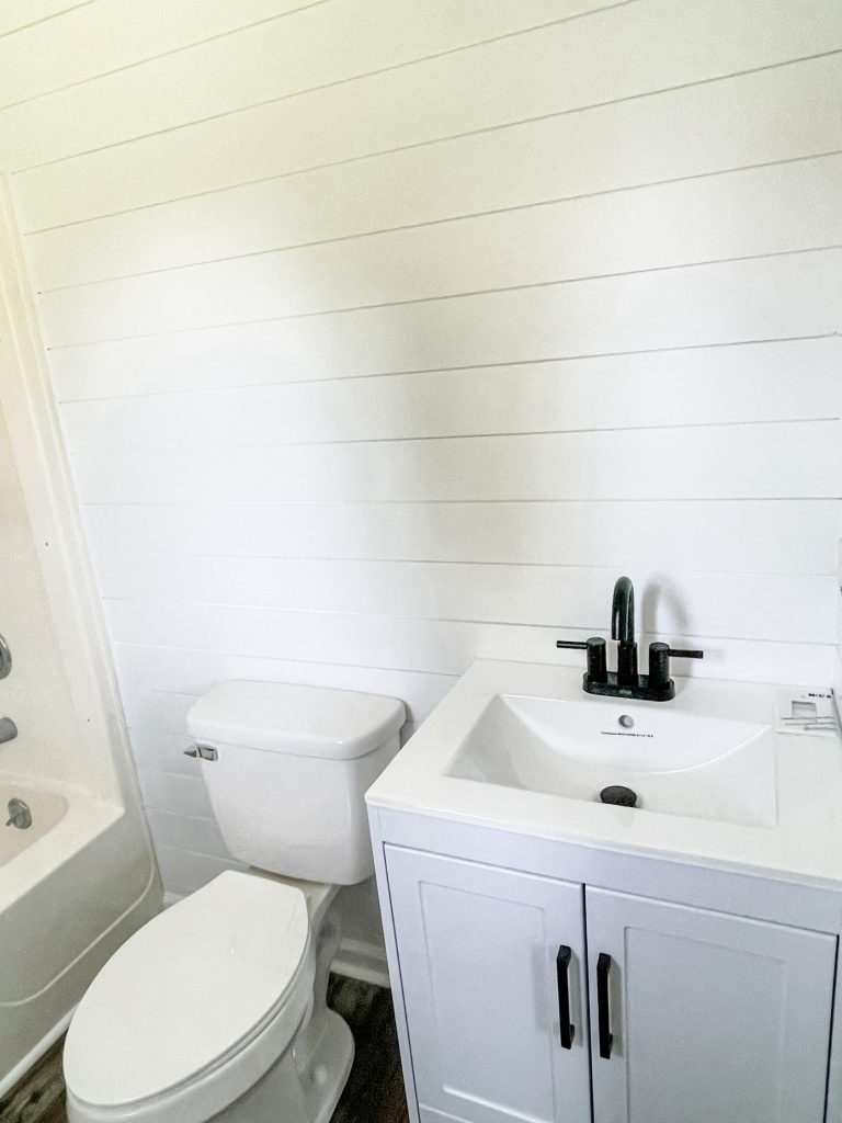
I have no words… other than WOW. Here’s the details!
- vanity: from Lowes (came this color)
- pulls: amazon (same as the others)
- faucet: from Lowes
- toilet: from Lowes
- kept original shower
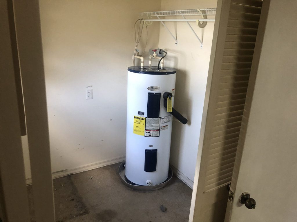
Laundry Room Before
The laundry room is basically a large closet, but with a water heater in it. The other side has a tiny bit of shelving!
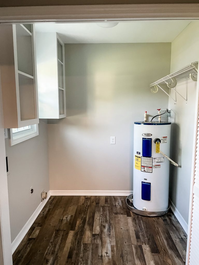
Laundry Room After
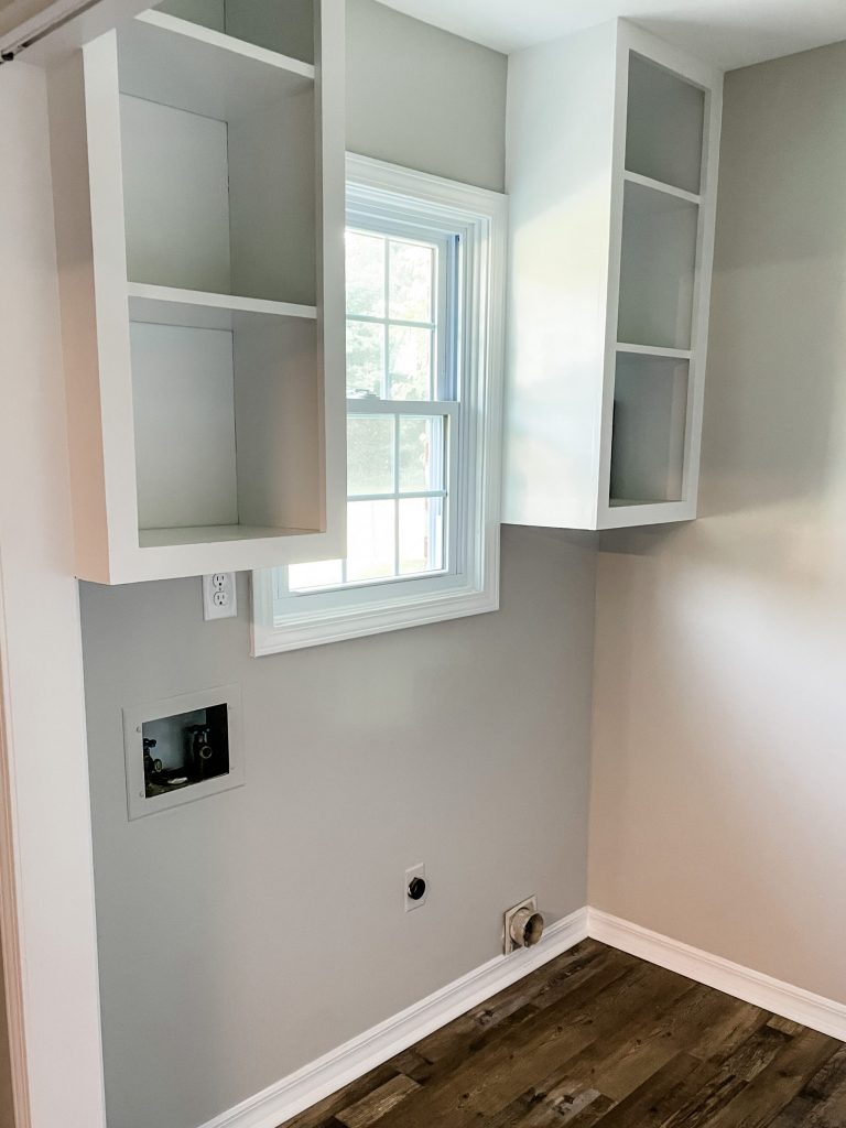
Unfortunately, we had to keep the water heater in the same spot… but at least it’s in a MUCH nicer space!
Just like everything else… same flooring, same fresh paint, and the cabinets were just painted white!
Bonus Room Before
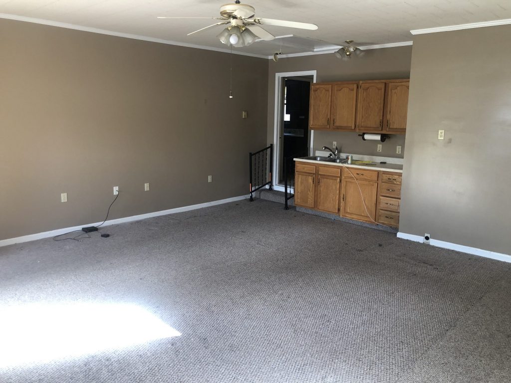
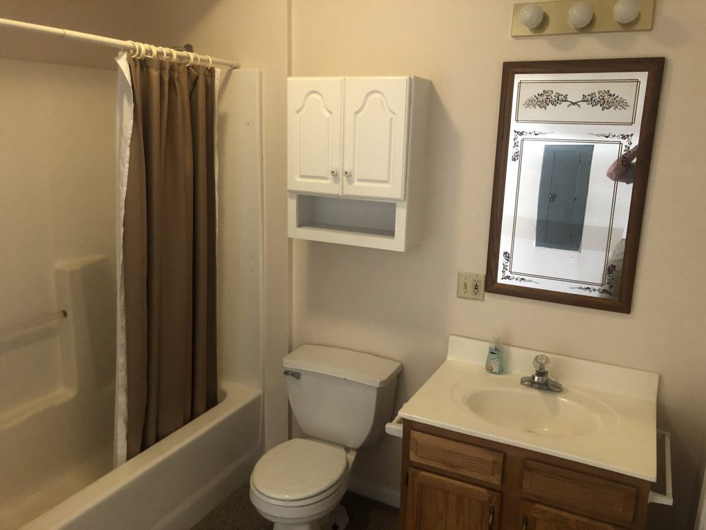
Something that’s SUPER cool about this house, is it has a huge bonus room! wet even has an area for a kitchenette AND a bathroom! This could totally be used for a little apartment space… or whatever the new owners want it for! LOL
Bonus Room After
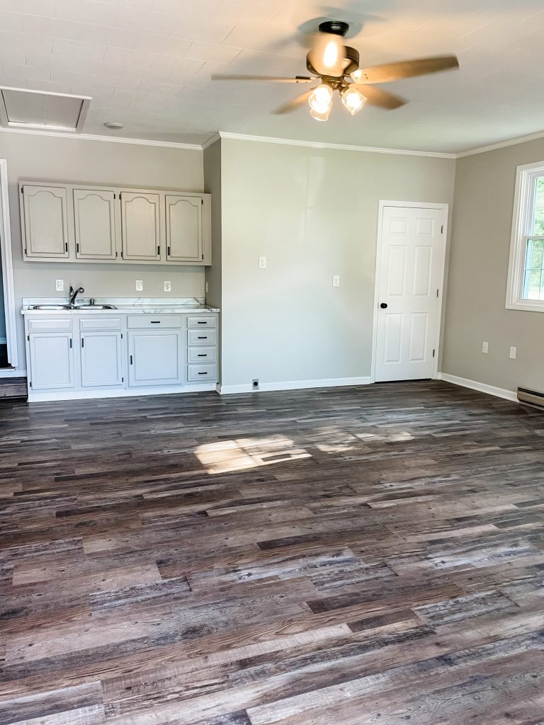
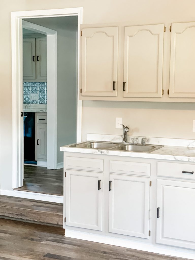
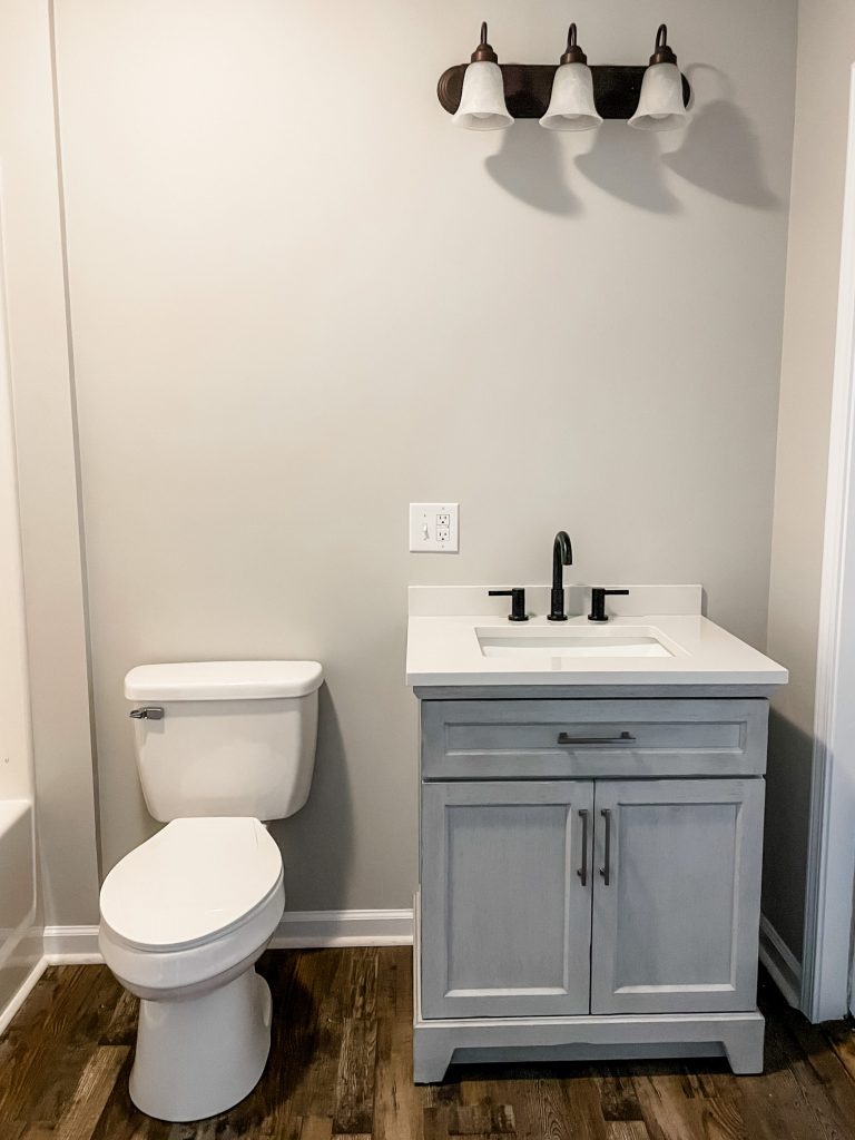
Same drill in this room! Same paint, same flooring, same pulls… and the cabinets were painted the same as the kitchen, which was Mindful Grey by Sherwin Williams!
The bathroom vanity is from Lowes!
Exterior Before
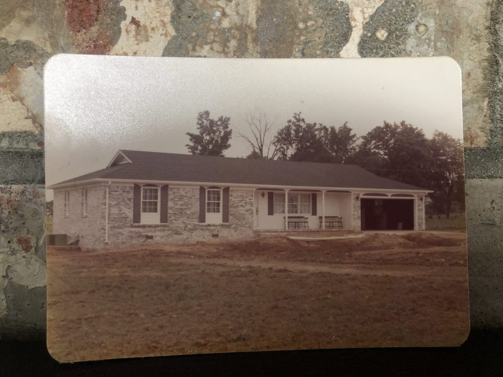
The outside wasn’t that bad at all! It just needed to match the inside a little better… Also, how cool is this original picture from when the house was built in ’74?!?!
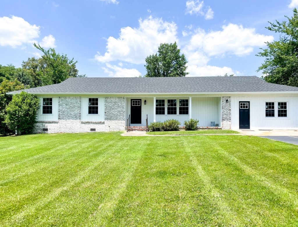
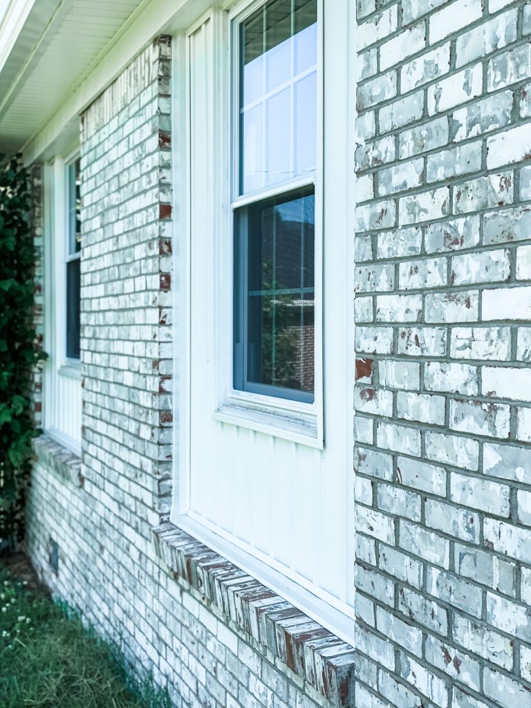
Exterior After
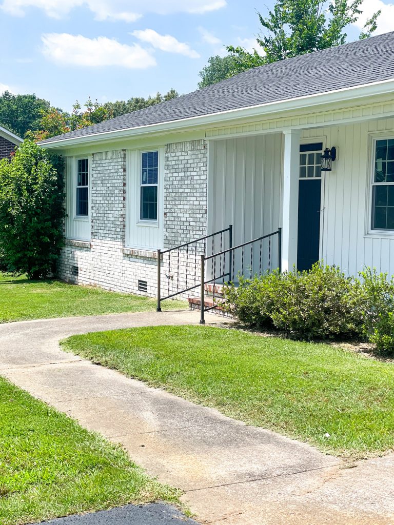
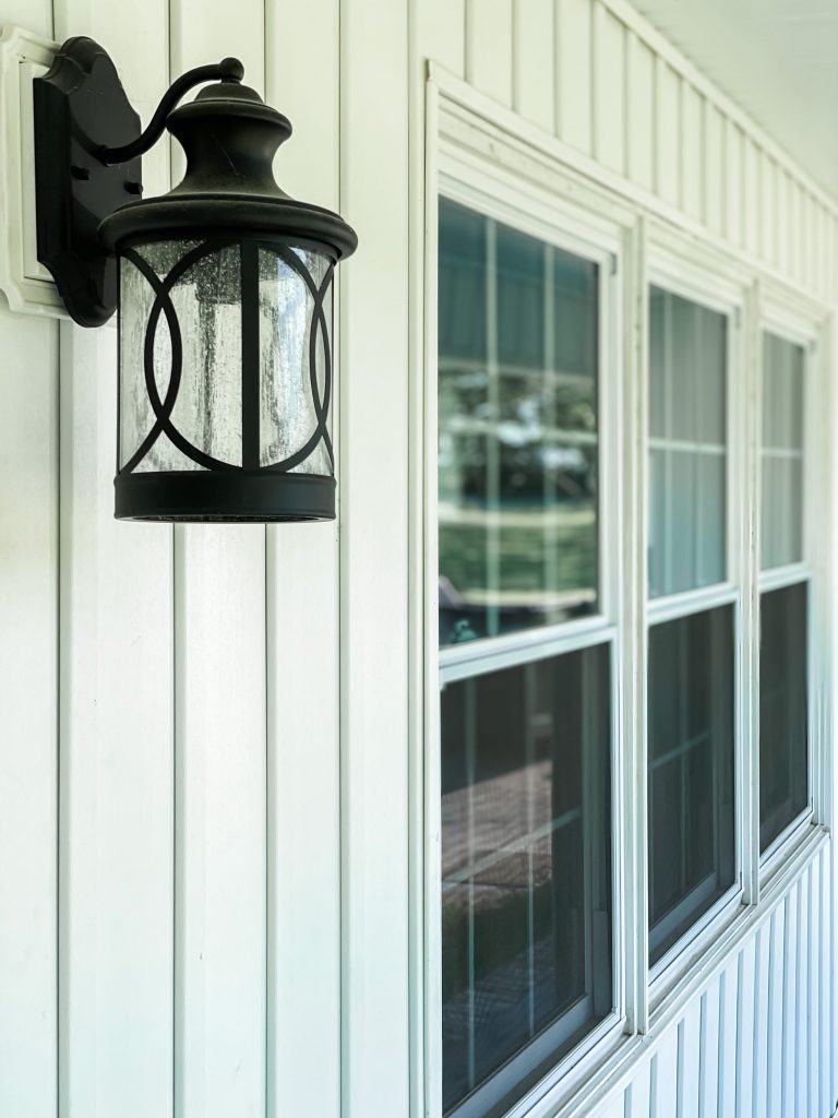
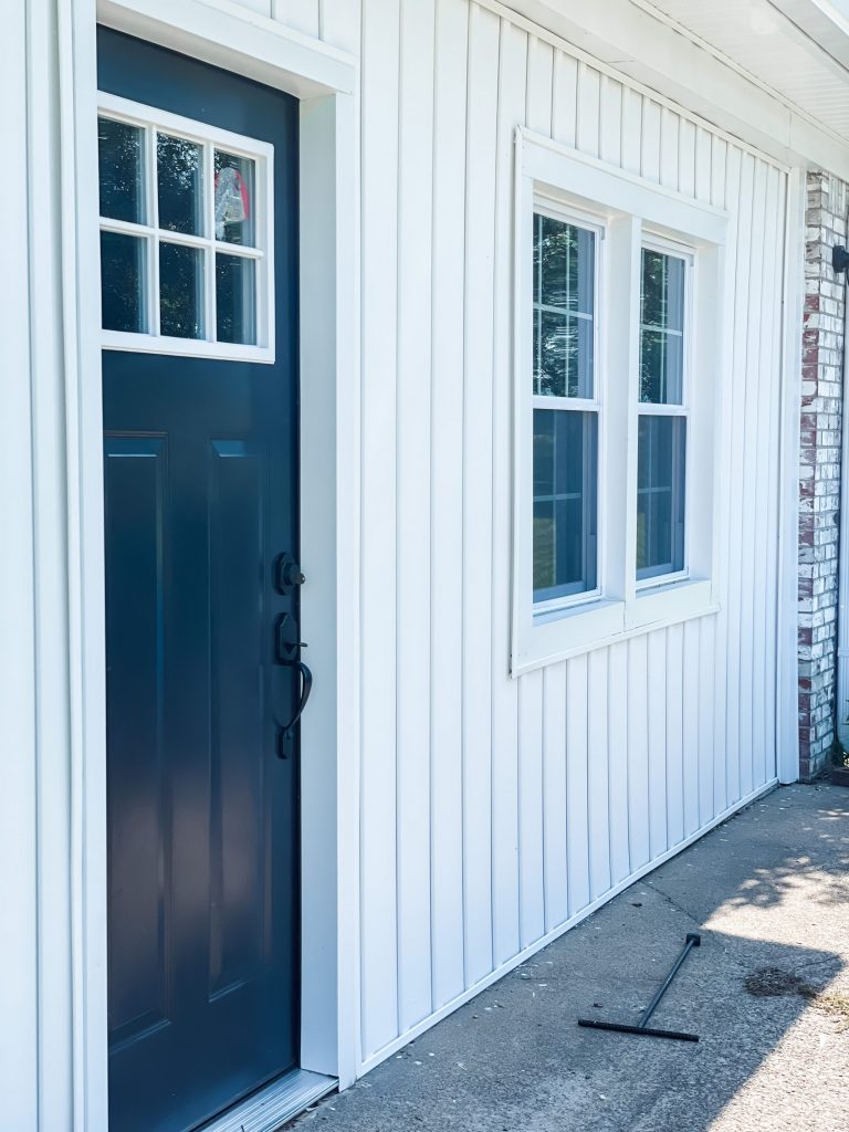
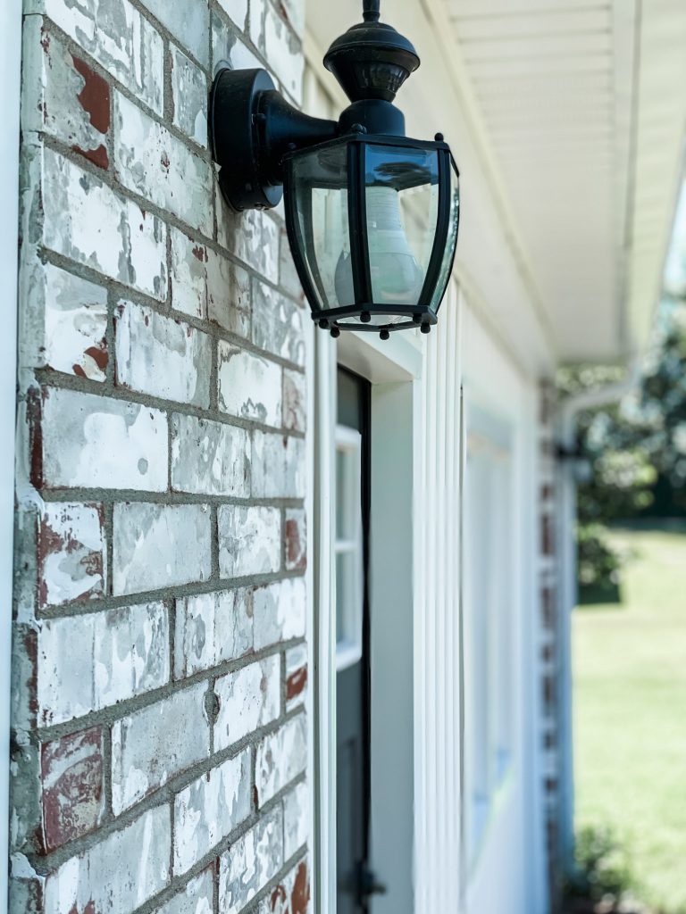
One thing that we absolutely LOVE that we did was keep the brick original. We loved it to begin with, and I think the pops of black help it stand out!
We got a new front door, all new windows, new roof, and new vinyl. We also bought new posts for the front porch.
As you can see… we gave this house some much needed TLC- and now, it’s ready for it’s new owners to come in and make it a home!
If you are in the market to flip a house, I will say… there is a LOT of work and decision making involved, but it is always worth it to see the amazing transformations come to life!
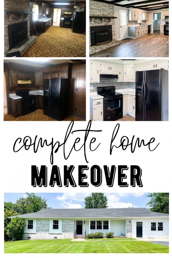
Side by Side
MAKE SURE TO PIN!


Last Updated on June 17, 2021





Beautiful job! The bonus area would be perfect for an adult child to live, or in-law suite, or rental income. It would be a perfect efficiency apartment.
Beautifully done!
Amazing what a little love can do.
Lighter, brighter and 100% improvement! Good vision and great results! Love it!
We are in LOVE with our new home! I love being able to see how far it has come. You guys did an amazing job. 😍
You brought this house from the 70’s into 2022!! Love the flooring throughout the house!! No reason this house won’t sell fast!!
You guys did a FANTASTIC job on this house!! It was SO DARK before…but looks nice and bright, and cheery!! Congratulations!