I have told you that while living in our single wide right now, our kids (ages 3 &5) will be sharing a room! Well, let me say one thing- my kids are loving being in the same room! I guess they are at that age where they think it is “cool”! The challenge with this set up is decorating a room that a boy and girl are sharing! I want my daughter’s side to be a reflection of her and be “girly”- but I want my son’s side to be a reflection of him and be “boyish”. I also want it to flow nicely together. I will be honest, this has not been the easiest for me, but it is truly coming together VERY good. I can’t wait to show you soon how I have it all set up. Now, don’t be expecting anything spectacular, but it is very cute 🙂
The dilemma I am in right now is that I have recently painted Eden’s little small chest that I found for sale on Facebook several months ago (whew did it need a makeover!). It looks cute the way it is, but I wonder if if needs a little something MORE to set it apart and make it have some personality?? I will let you tell me in the comments!
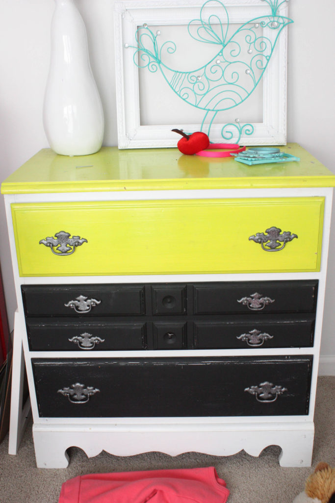
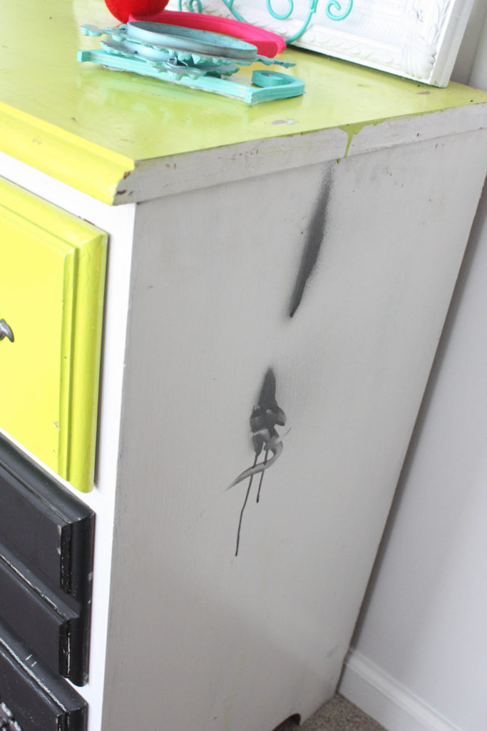
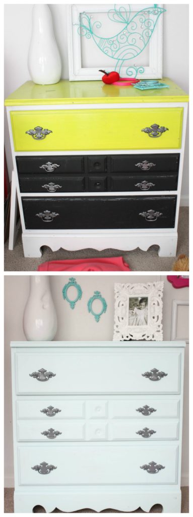
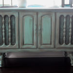
Take a look at what we started with:
Yikes. Some paint jobs just don’t have enough words to describe them. Luckily, paint is a powerful resource!!
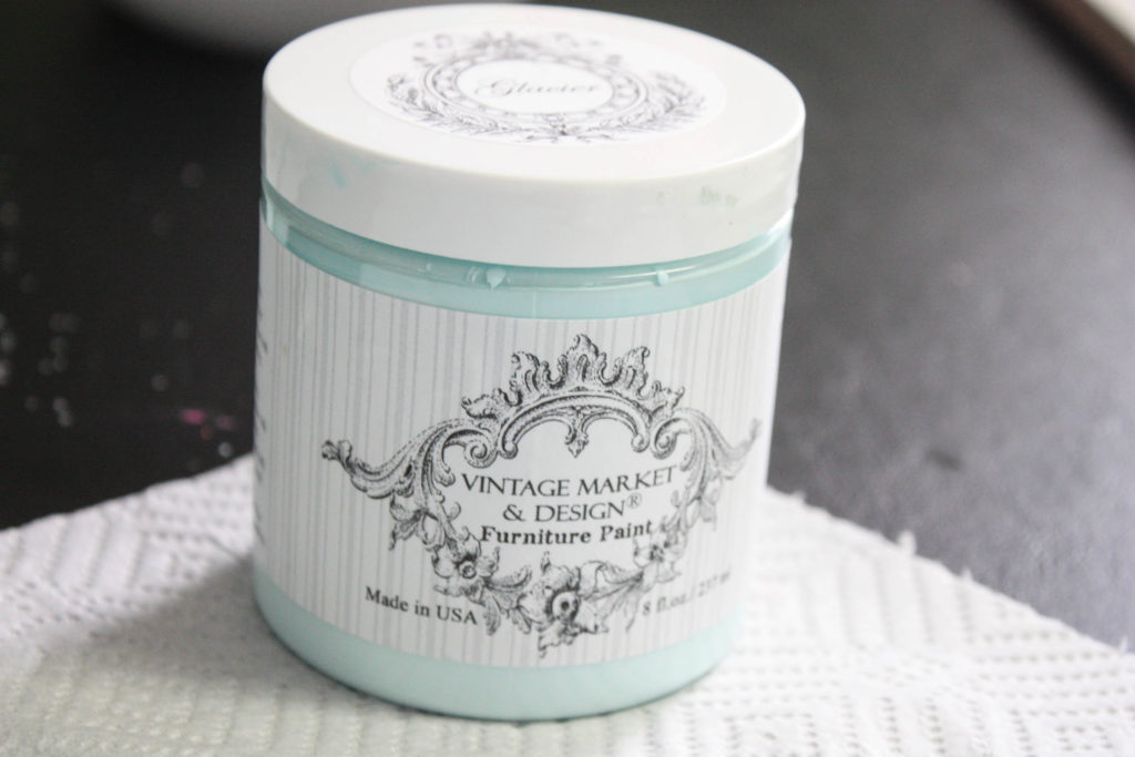
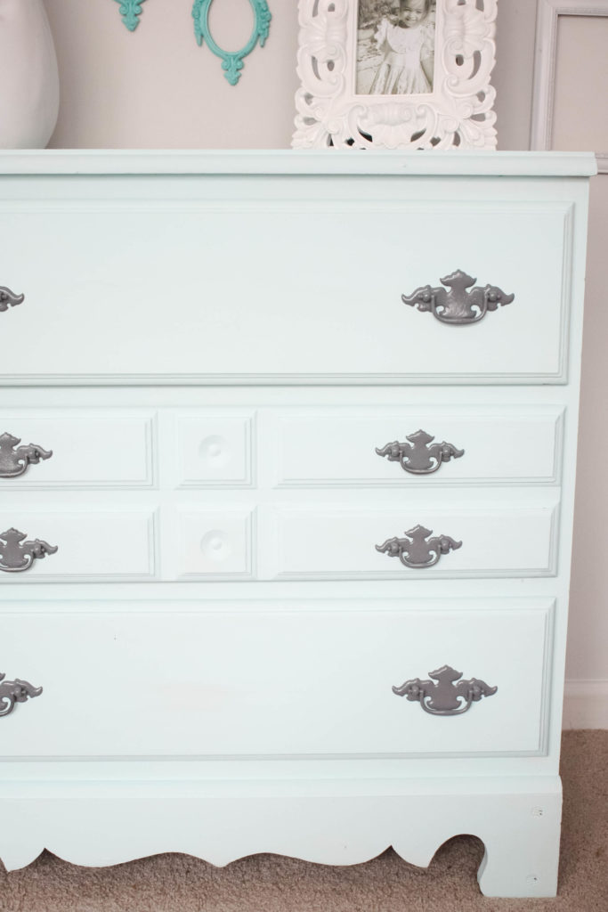
I knew I wanted to paint this piece with Vintage Market & Design chalk paint, Glacier. I LOVE this color, and it is the perfect aqua for her room. In fact, her little end table is the same color. (My Pallet Coat Rack was also done in this color!)
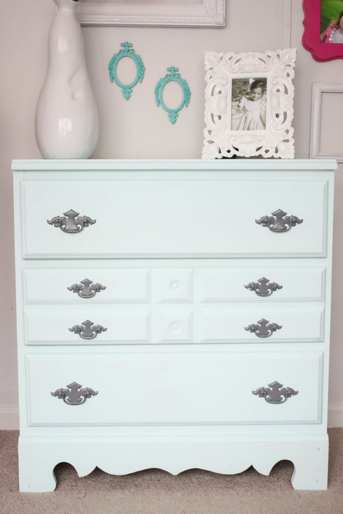
All I did for this piece was get my Purdy paintbrush (a good brush is vital in painting furniture) and start painting. With chalk paint, there is no sanding required. It adheres nicely to most all surfaces. This did require 2 full coats, and I may even touch up some more spots soon. I didn’t even use half of this 8 oz tub, though. That is another good thing about chalk paint- it lasts a LONG time! Yes, it is pricier, but it is worth it. I also spray painted the existing hardware with Rustoleum’s Dark Gray spray paint that I had on hand.
Here it is now~and what I need YOUR opinion on. Is it too “simple”, or is it just right? I had thought about doing a stripe down the middle like I have seen before or possibly some other designs to add character, but I don’t want it to be too much. Let me know your thoughts in the comments!
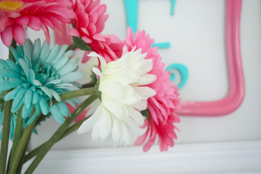
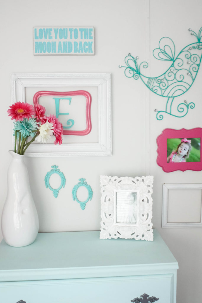
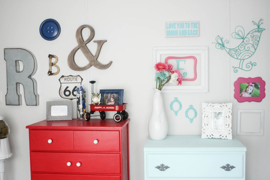
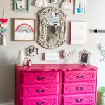
And here is a little sneak into what the full wall looks like. On the left is Blaize’s chest from his previous Americana room, along with his little gallery wall, right beside Eden’s newly painted chest and her little gallery wall. His side is done in red, navy and gray…and her side is navy, hot pink and aqua with some gray. What do you think so far?
There you have it! A cute little chest makeover that I am still debating over, along with a small little peek into what their shared room is looking like! Tell me YOUR thoughts 🙂 I can’t wait to hear.
I want to be updated when a NEW post goes live!
Follow Along on Social Media!
Facebook/Pinterest/Instagram/Twitter
Pin for Later!
Last Updated on October 28, 2016

I think it looks gorgeous as is Brooke but if you did decide to do a stripe down the middle how about using one of those beautiful pinks from the frames on the wall?
It is beautiful! I would add a touch of grey, which would also pull out the grey in the R and the photo frame. But it could add just some subtle detail to give the piece a little more interest. Just a smidge, not a lot of grey.
I love it as is!
I LOVE the simplicity!!! You have lots of other fun color pops and decor above and around it so it isn’t “boring” by any means. That color rocks my socks!
It is perfect as it is. Beautiful color will go from little to older.
Sometimes less is more.
Because of you I have used Vintage Market chalk paint and just finished a piece in Glacier. It’s so beautiful.
Love seeing all you do, creative person!
Hi Brooke – Love the colour – I think it would look nice perhaps by using a small stencil say, on the top and bottom drawer – either in a darker blue – something like the ‘E’ and the two small frames – or a pale grey?
Another idea perhaps – is – you could put a light ‘glaze’ on it if you wanted more depth?
I agree that the center of the top & bottom drawers could use a little something. Love it like it is too…
I looked again. Can you put the middle drawer into the top slot? That may be all it needs.
I think it looks gorgeous as is Brooke but if you were considering a stripe down the middle, what about white and one of the pinks used in the adorable frames hanging above the dresser?
It looks beautiful. I would not change a thing.
With the texture on the center drawer, I would just let it be. It is serene and interesting. Awesome job!!!
How about a stripe or two made w/ washi tape? So easy to add/remove to change it up or get rid of if you decide you want it simple and classic again!
I think it’s fine as is so that it doesn’t compete with anything on the wall. If you choose to add to it I would make it very subtle for the same reason. Maybe a stencil done in just a shimmer, or top coat the entire thing in a shimmer/pearly coat. Just my opinion.
Love it! That color is so soft and gorgeous!
Love it just the way it is …..you do such a great job on everything you do …..
I know this is an older post but I love this dresser! I have been coming to this blog post over and over because I want to re-do a dresser for my little girl’s room but I’ve never done it before and don’t know where to start. Where do you get your paint from and what type of brushes should I use for furniture like this?
Thanks for the inspiration!
I am in love with this color! Thank you tips on chaulk paint. This is one gorgeous transformation. Love it