If you have heard me say it once, you have heard me say it 1000 times. “You have to look past the ugly.” In order to score the best deals and make the most profit {if that is what you are in it for}, you have to be able to look past the ugly and see the potential. Is that always easy? No. There are times it can be a real challenge, no doubt…but it is totally worth it in the long run.
I wanted to showcase those before and afters of our home that I have shared so far with you, along with more before pictures that you have not seen yet {room reveals are just not ready!} Some of you are new followers and may not realize this, but my husband and I bought a foreclosure 2 years ago and have renovated the entire home. It sat vacant for several years and had gotten very run down. It desperately needed re-fabbing. {Like how I threw that in there?!} When I came and looked at the house the first time, I will be honest…it was bad. I mean, it was real bad. BUT…never once did I not see the potential. There were SO many features that I loved about this home, and I knew we could make it a beautiful space. The price was DEFINITELY right, and even though I knew that I didn’t want it to be our forever home {because I want land in the country}, I couldn’t say no to the adventure.
I want to kind of disect the rooms and give some insight into the potential I saw when we first looked at the home. So…here we go!
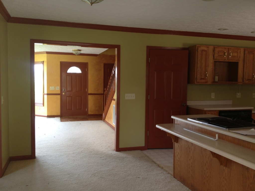
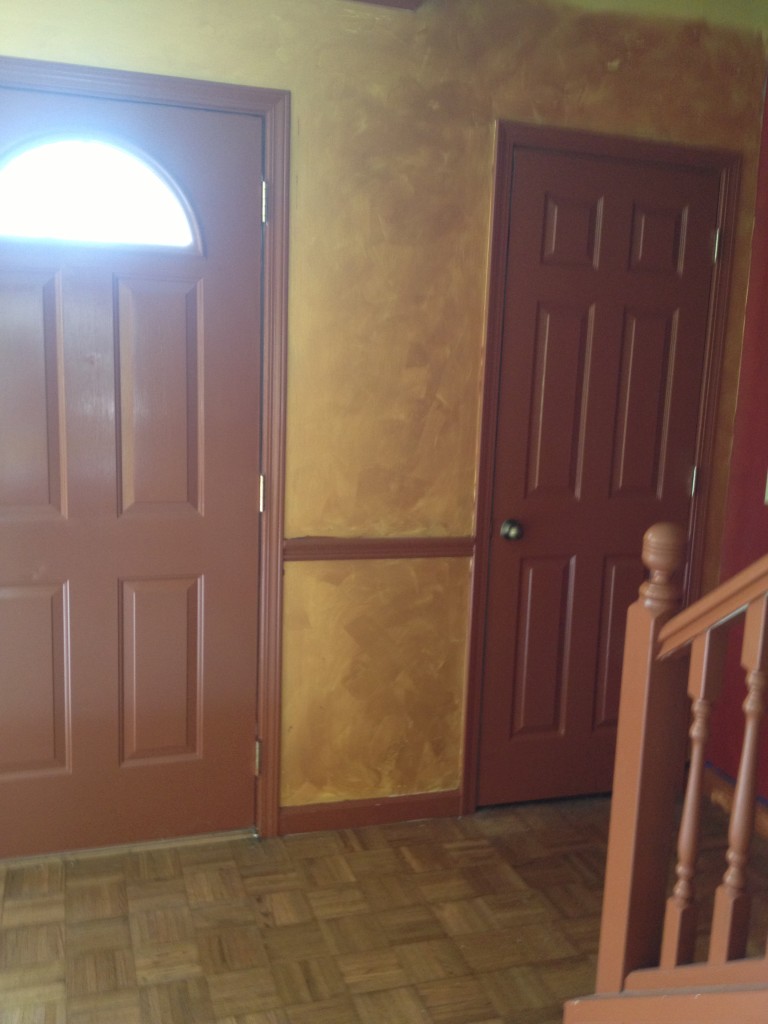
Let’s start with the entry to the home. That seems fitting. {Remember..these are iphone pics taken long before a blog was in the works}
This is the view of our entrance from the kitchen.
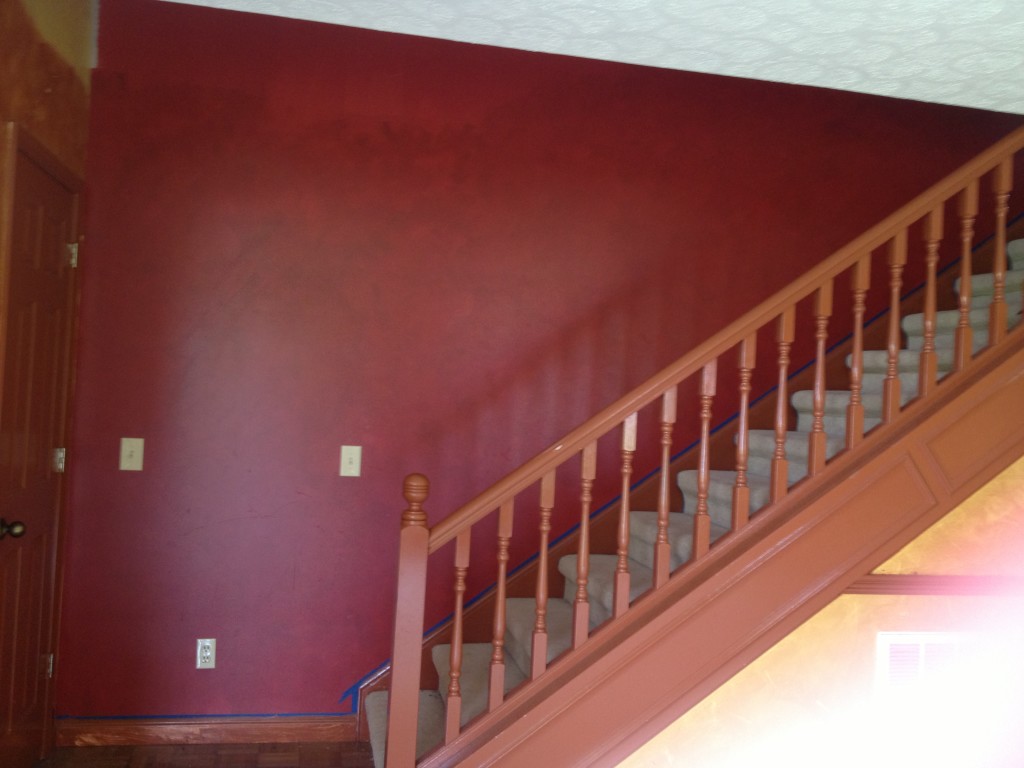
Ok. So…what could I have possibly seen that looked appealing you might ask? First of all, I liked that there was a coat closet right beside the front door. This would provide some extra storage. We would be leaving a home with LOTS of storage, and this one did not have very much, especially in comparison. I also liked the pretty stairwell off to the side. I knew it would be beautiful painted white, and let’s face it…that is totally just cosmetic. I knew this whole area could be beautiful once it was painted with new flooring and doors.
*Let me just go ahead and say this. So much of what you see in a fixer upper is truly just cosmetic. Cosmetic meaning painting, light fixtures, hardware, etc… You know, the little fixes that make a huge difference? While some spaces may need complete demo or major renovations, many can be fixed up very nicely with just a few cosmetic changes. Those changes can be made relatively inexpensive and can increase the value tremendously, especially if you do the work yourself.*
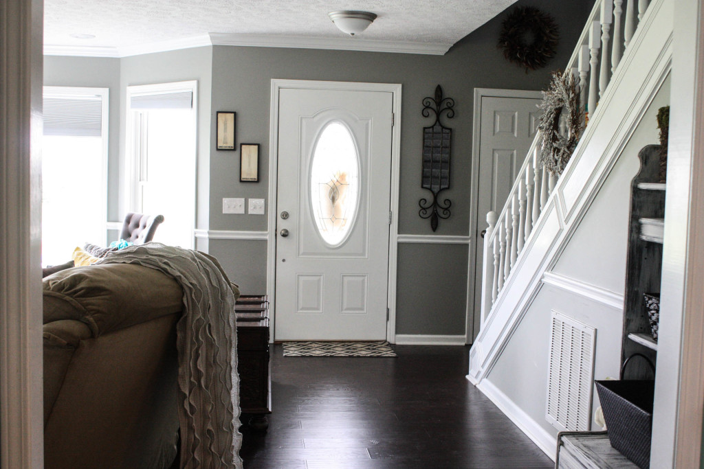
Here is how it looks now:
See what I mean?! With new paint, new doors and new flooring~ this space was completely transformed!
So since we are already in this area, let’s move on to the living area.
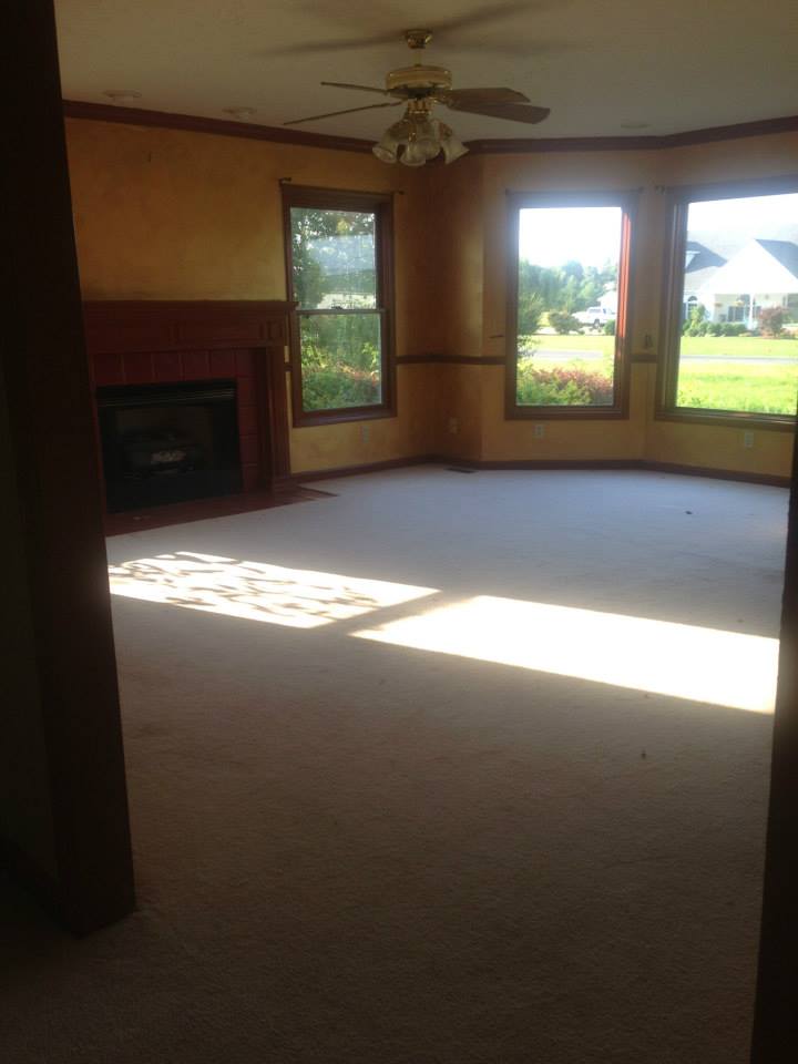
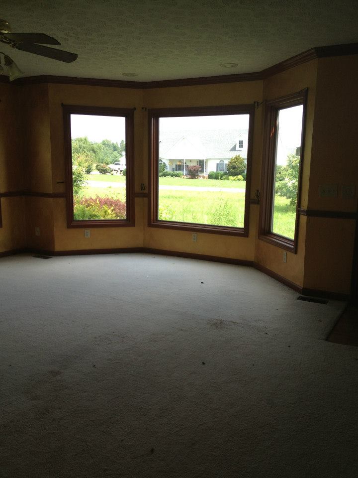
It was pretty brutal…so beware.
This picture is so dark {no electricity on when I took these pictures}. Can you see the fireplace? It is red and blends with the darkness! (HA!)
The colors…oh the colors… I just will never understand how someone thought this was a good idea.
The carpet was stained and filthy, the windows were in desperate need of changing out {in fact, we put in new windows throughout the entire home}, and the fixtures were all falling apart…but other than that, the room was great! Look at those bay windows! So much natural light in this room…and the space is very large. Plus, I have always wanted a fireplace so I was super excited. Sure, it’s ugly now…but the could be was really exciting for me.
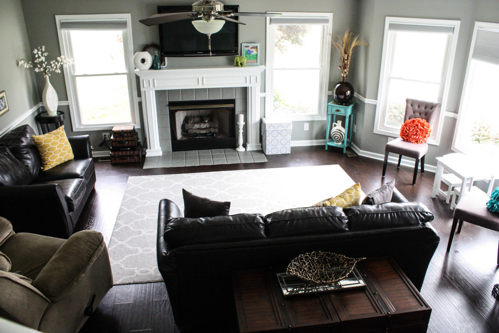
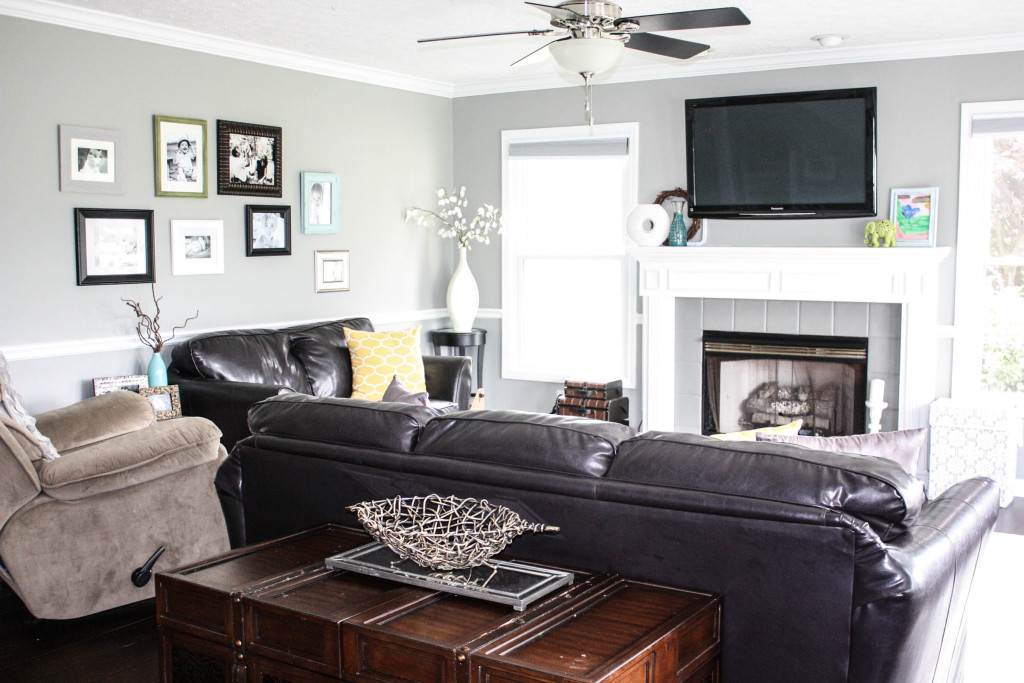
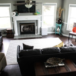
Here it is now: {full view from the stairs}
We painted walls and trim, painted fireplace {mantle and tile}, changed windows, put in new flooring {same as entrance, obviously} and BAM…look at the difference! I must admit, this room changes daily because I can’t leave anything alone. In fact, it is already a little different that when I took this picture, but hey…I don’t have enough hours in the day to take pictures everytime I make a change 🙂
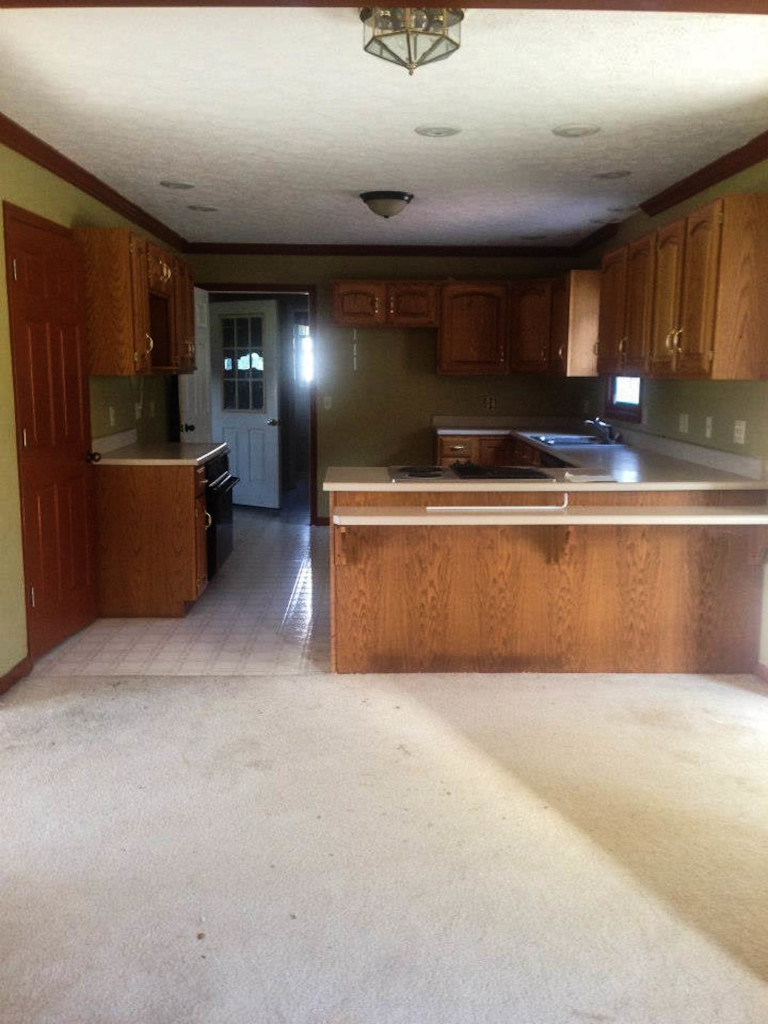
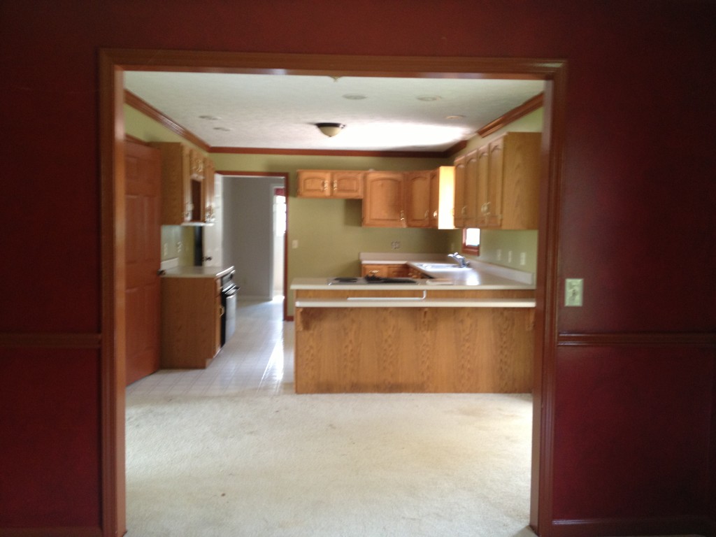
Now let’s move on to the kitchen area. The picture is definitely not the best, but it will give you a good idea of what we had on hand.
{Sorry for the blurriness. How embarrassing!}
So here is the deal. I liked this kitchen for one reason- the size and the layout {ok, 2 reasons}. There was a lot we wanted to change, but because of the good layout and the size, we did not have to make any structural moves.
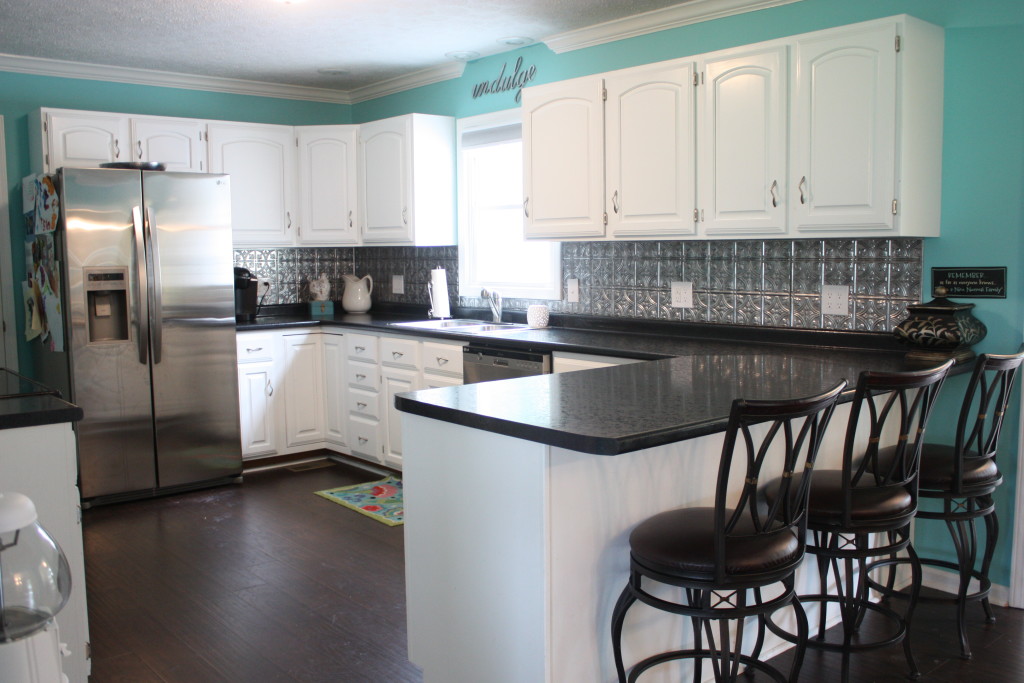
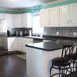
Here it is now:
{Pardon the dirt on the floor…it’s real life around here!} I am sorry that this picture is not from the EXACT location of the before picture, but you can definitely get the idea. Basically, the cabinets were painted, new hardware put on, new backsplash installed, flooring from entrance/living area continued, new countertops, new appliances, trim and walls painted, moved the cook top from the bar and extended it for seating and a few other changes. Nothing too crazy…just lots of things that pulled the space together into a now beautiful, updated space. Yes, I know not everyone would want an aqua kitchen, but we love the bright and airy feel…so we are very happy with it!
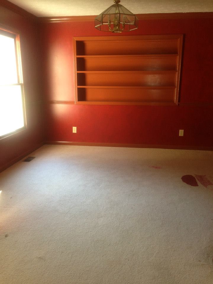
Right beside the kitchen is dining room. In fact, the pictures of the kitchen before were both taken from that room. It was pretty darn bad.
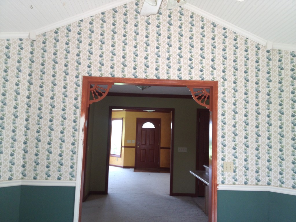
Let’s take a look:
Whoa Nelly. What in the world? And oh yeah, just spill the paint and leave it. Never in all my life.
BUT, despite the despair…I loved it. I loved that I actually had a true dining space, even though it was small… and I loved the built ins. So, it was still a winner.
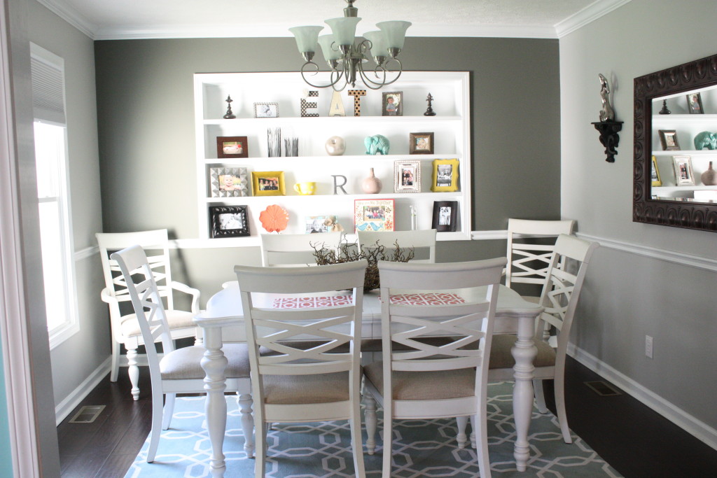
Here it is now:
Paint and flooring, y’all. That is all it took! {And of course some decorative touches}
There are a few more rooms on this floor, but I have not revealed them yet. They are just simply not ready. I will go ahead and show a before picture of one of them to you now.
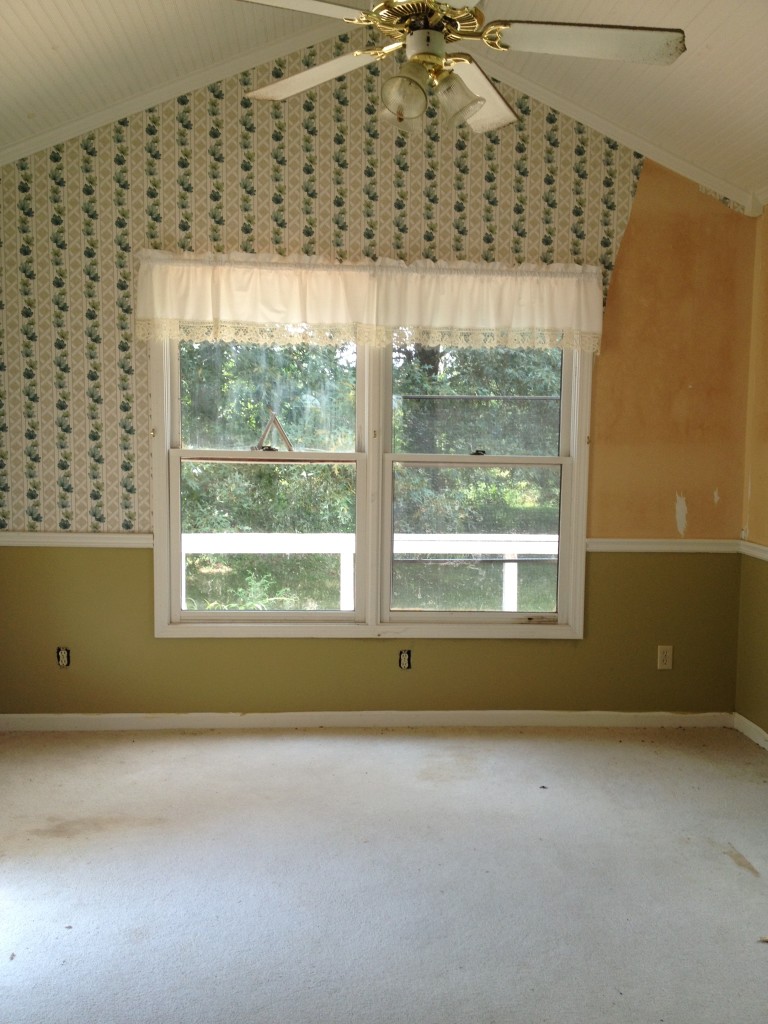
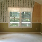
This is the breakfast nook, or that is what I call it anyway. It is a nice room with lots of light coming in, and it is situated right off the kitchen.
Yes, you are seeing correctly. It has several shades of varying colors, stained carpets and partial wallpaper.
While this room has been painted and updated, it is where I paint all of my furniture for my side business and where we keep all of our paperwork, etc… Right now, it is NOT ready to show! But I had to show you this space..because…well…I mean, how could I not?!
There is also a half bath and laundry room downstairs, but I am gonna skip those pics and show them at a later date.
Basically what I wanted to show you in this post is that any place can be made into something beautiful if you are willing to look past the ugly. This home was truly a site for sore eyes, no doubt…but with some vision and work, it has become a place that I am truly proud to call my home. While we will be selling in the coming months, I can say with all honesty that this home has been just that, a home. We have made memories, messes and mistakes…and we have had a WHOLE lot of FUN.
For full room reveals, you can click on the thumbnails and it will take you to each post.
Pin for Later:
Linking up at:
Last Updated on October 11, 2015








Wow it is a huge difference, you have made it beautiful. The house was great to start with just needed your love.
Thank you very much, Catherine! Yes, it was a great house to begin with. Hard to believe someone didn’t snatch it up earlier! I think it’s just so hard for some people to see past the “work” it needs!
You certainly had the vision to take a hot mess with good bones into a home that looks HOT!!! Actually, it is very cool, calm and inviting…I would love to live there!! Hate all the sterile white walls in my house, but can’t get hubby to change the colors 🙁
Thank you so much, Susan! I appreciate that! I don’t know what I would do if I couldn’t paint walls! Guess I would be accenting a whole lot! HA! 🙂
you have done an awesome job with every thing my word it looks like a brand new house love it xx
Thank you so much!!! I sure do appreciate that 🙂
Hi Brooke – I can see why you wanted to purchase this house – as you say – sooooo much space and lots of light with some nice added ‘touches’ with your ‘built ins’, the ‘apex’ styled roof, big windows etc etc – you have made your ‘ugly house’ into a ‘beautiful home’ – your like me cos that’s exactly what I love doing. I can’t count the amount of times I have moved house – but ‘countless times’ and loved every minute working on them 🙂 It’s like a ‘bug’ or something isn’t it ? but a ‘nice bug’ 🙂
Yes! A good bug 🙂 Thank you so much! As you know, it is a lot of work..but so worth it!!
I totally get what you saw in the house, it has so much charm! We are house hunting now and I would love an older home, there is just so much more detail in older homes.
Can’t wait to see your home finished!
Thanks so much! 🙂 This house is around 15 years old, but it seems older, lol. We are looking for a farm now, and I would LOVE an old farmhouse to fix up…just so much more charm, like you said! Thanks again!!
Oh my goodness what awesome transformations!! Your home looks beautiful and it sure shows that you have a real talent for decorating. Found you through the link party.
Thank you so much, Alicia!! It has been so fun to watch things come into place! It needed so much work when we bought it, including roof, windows, unit and the “non fun” stuff…but it was so worth it! I appreciate your compliments and taking the time to comment 🙂 Thanks again!
LOVE WHAT YOU”RE DOING TO THIS HOUSE!!!! Way to go, girl. I’m doing it right along with you, so I know all the hard work! 🙂
Thank you so much, Kammy!!! Yes you certainly do!! It is hard work but so worth it!
Wow Brooke! What a transformation! You guys must be exhausted!!! The paint you chose truly goes a long way!!! Great job on everything! Thanks so much for sharing your before and after with Dream. Create. Inspire. Link. I hope you will join us again tomorrow night. Take care, Tara
Thank you, Tara! Yes it was ALOT of work- new windows, unit, roof, paint…you know- the norm! Lol. Totally worth it, and I really appreciate your compliments!!
Hi Brooke! I saw your post on Make It Pretty Monday. We just finished renovating a lake house ourselves, and I agree that you have to look past the ugly. I enjoyed looking at your renovation. It is amazing!!!
Thank you so much, Sherry! I appreciate that very much. If you look past it, the outcome can be amazing!! I am sure your lake house turned out amazing too.
Brooke, it’s all so amazing! Thank you for sharing. You are one of the fan favorites at the Sunday Showcase from the Make it Pretty Monday party at The Dedicated House. Here is the link so you can check out your feature. http://www.thededicatedhouse.com/2015/09/the-sunday-showcase-from-make-it-pretty_20.html Hope to see you again tomorrow at the party. Toodles, Kathryn @TheDedicatedHouse
Yay!! That’s awesome! Thank you very much!!
You’ve done an outstanding job – truly – it’s just stunning !
I can look past the ugly ( our current house was the ugliest I’ve ever seen and STILL has a long way to go ) wish I were at the point you’re at !
Just beautiful !
Thank you VERY much Suzan!! I sure do appreciate that! We still have some work to do, but it has come a very long way! 🙂
You are awesome with what you do,love the update very pretty.
Just gorgeous! Thank you for sharing! You are a genius!!
Hi Brook, I was wanting to know the procedure that you used for your kitchen cabinets., as well as the prep work that was used. I know that you’re on Mackinac Island right now. I live in Barton City, which is about 2 hours from the island. Enjoy your vacation and hopefully I hear from you soon. Thanks, Nancy Newberger